
A/B testing is everywhere, but good luck explaining p-values to your CFO. When the question is “Which feature wins?”, most stakeholders don’t care about confidence intervals, they want a clear answer.
I’ve always found Bayesian A/B testing more intuitive and far better for communicating results. In this post, we’ll break down why.
Say we want to decide if a green button will perform better than a blue one, so we go ahead and run an A/B test. In the end, people usually want to know just one thing: “Is A better than B?”
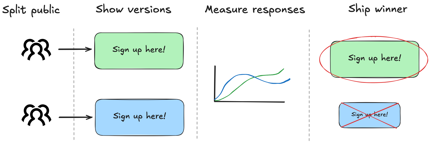
After 500 visitors see each button, the numbers are in:
- Green: 27 sign-ups — that’s 5.4%.
- Blue: 23 sign-ups — 4.6%
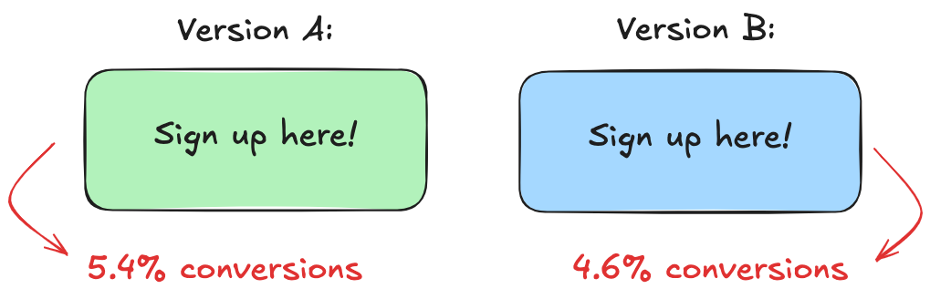
This is where many stop. They see the numbers and declare a winner: green beats blue. But we know better than to take numbers at face value.
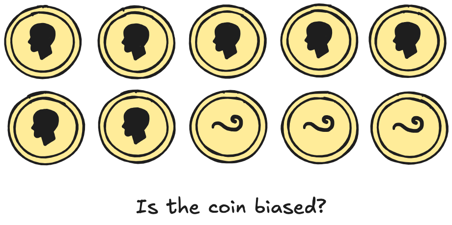
Think about it: if you flip a coin 10 times and get 7 heads, would you bet your savings that it’s rigged? Probably not. With such a small sample, randomness can easily skew the result.
The same logic applies here. Green got 5.4%, blue got 4.6% so it looks like a win, but it’s just a snapshot. Rerun the test, and those numbers could flip. Like the coin toss, there’s an underlying truth we just can’t see yet.
That’s what makes A/B testing hard: It’s about the uncertainty behind the numbers we see. How do we measure it? How do we quantify the risk of acting on too little data?
Measuring uncertainty the usual way
Using the textbook method to measure uncertainty, we need to know how likely it is that the difference we saw (5.4% for Green and 4.6% for Blue) is actually real and not just a fluke.
Think of it this way: if we ran this exact experiment 1,000 times, how often would Green actually outperform Blue? Would it win 900 times? 700? Or just 400? If Green wins less than half the time, then it’s not really a winner, it just got lucky the first time we ran the test.
This is where frequentist statistics hands us a tool: the p-value.
To understand it, we start by assuming the opposite of what we’re trying to prove: that there’s no real difference between Green and Blue. If they’re equally good, then any difference we observe must be due to random chance.
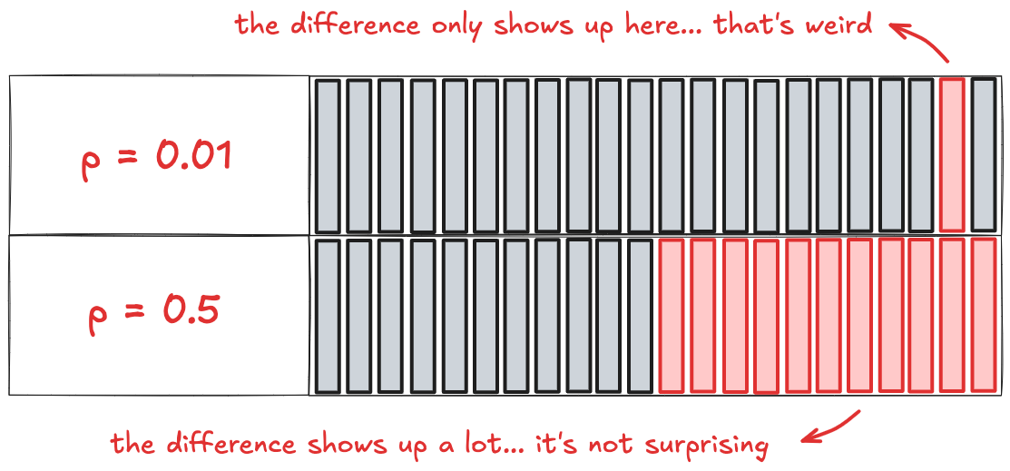
Now imagine plotting all the differences you’d see across thousands of these random experiments. You’d get a bell-shaped curve centered at zero, because most of the time, chance alone won’t budge the results very far.
That’s the graph you see below. The middle of the curve represents small, harmless fluctuations: the noise we expect when nothing’s really going on. The tails are where things get weird: the rare, extreme results that pop up once in a while.
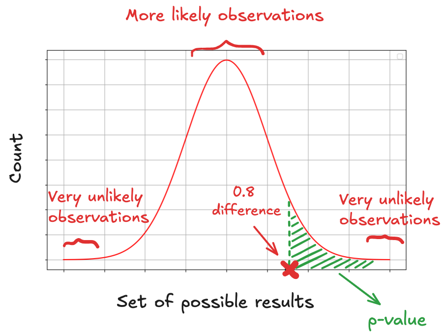
A p-value doesn’t tell you the probability that Green is better than Blue. It tells us:
If Green and Blue were actually equally as good, how likely is it that we’d see a difference as big as 0.8% (or more) just by random chance?
A low p-value, like 0.01, means that if the buttons were actually equally good, seeing a result like 5.4% for Green and 4.6% for Blue would be rare. It might happen just 1 in 100 times, purely due to chance. It’s like saying: “If there’s no real difference, this result shouldn’t be showing up... and yet it did.”
That’s why a low p-value is treated as a signal that something might be going on. But if the p-value is high (say, 0.5) that means a result like 5.4% vs. 4.6% would be totally normal even if the buttons were identical. There’s nothing unusual to explain, therefore strong reason to believe one button is actually better.
A p-value doesn’t tell you how likely Green is actually better, only how much your result challenges the assumption that there’s no real difference.
In frequentist statistics, the hypothesis is fixed and the data is random. The guiding idea is: “There’s a true answer out there; we just observed a noisy sample of it.”
You run an A/B test and get 27 sign-ups for Green and 23 for Blue. A frequentist won’t say “there’s a 70% chance Green is better.” Instead, they ask: “If Green and Blue performed exactly the same, how likely would it be to see a result this extreme just by chance?” Green either is better or isn’t. There’s no room for uncertainty about the hypothesis itself.
That makes communicating results tricky. Try explaining p-values and null hypotheses to a CFO who just wants to know if we should switch to the green button. Frequentist methods are statistically sound, but they don't speak the language of probability most people use.
Bayesian thinking flips that around.
Bayesians treat the data as fixed: 27 vs. 23, no arguing with that. What’s uncertain is the hypothesis: Is Green truly better than Blue? The Bayesian question becomes much more intuitive:
“Given what we observed, how likely is it that Green is better?”
That’s an answer you can take to a decision-maker.
Measuring uncertainty the Bayesian way
The Bayesian approach starts with a different question:
Given what I’ve seen, what’s the full range of possible conversion rates and how likely is each one?
Instead of giving you a binary verdict or a vague range, it shows you a distribution of beliefs: a spectrum of plausible values, shaped by your actual data. This more aligned with how we naturally think: not in black-and-white outcomes, but in shades of confidence.
To model uncertainty the Bayesian way, we build a probability distribution, that is, a curve that represents what we believe the true conversion rate could be, based on the data we have.
That’s where Bayes’ Rule comes in. It gives us the mathematical machinery to update our beliefs based on new evidence. Here's what it looks like:
 In words:

The prior is what we believed about the conversion rate before we saw any data. Maybe from past experiments or gut feel, we expect sign-up rates to usually fall somewhere between 3% and 7%. That’s our starting guess.
Then comes the likelihood, which asks: Given what we just saw, how well does each possible conversion rate explain it? If Green got 27 sign-ups out of 500 users, then rates like 5% or 6% make a lot of sense. A rate of 1% or 15%? Not really. The likelihood rewards values that make the data unsurprising.
Now we combine those two (the prior and the likelihood) to get the posterior. This is our new belief, updated with the evidence. It’s not a single number, but a full distribution that tells us how plausible each conversion rate is after seeing the results. This is what we actually care about.
Finally, there’s the evidence, technically called the marginal likelihood. It’s just the math that makes sure everything adds up to 100%. You can mostly ignore it unless you’re comparing models.
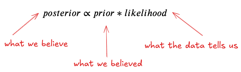
This tells us: What we now believe = What we believed × What the data tells us
To figure out what we now believe about a button’s true conversion rate, we first need to model what we believed before the test. This means we need a mathematical tool that can express that belief.
What do we already know about our site’s conversion rates? Are they usually around 5%? Closer to 10%? How likely is it that a new feature converts higher than 6%?
We capture that belief with a prior distribution: a curve that assigns different degrees of plausibility to different conversion rates. It doesn’t predict what will happen. It simply quantifies what we consider likely before we collect new evidence.
We know each visitor either converts or doesn’t (success or failure, yes or no). When we run an experiment with a fixed number of visitors and record how many convert, we’re counting the number of successes across a series of independent trials. That’s precisely the kind of process the binomial distribution is meant to describe: it tells us the probability of observing a certain number of conversions, given a fixed number of trials and a known conversion rate.
Tossing a coin is the textbook example of a binomial process. We have two possible outcomes: heads or tails. If the coin is fair, the probability of tails is 0.5.
Flip it 100 times, count the number of tails, and the binomial distribution tells us what kind of results to expect. It looks like this:
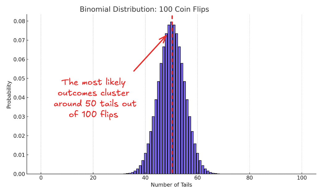
The highest probabilities cluster around 50 tails, with the odds dropping off as you move toward the extremes. That’s what the binomial distribution gives you: what to expect when you already know the odds.
But in A/B testing, we don’t know the odds, we’re trying to infer it from the data.
To do that, we need a different kind of curve, one that represents our uncertainty about the conversion rate itself. Something that shows all the possible values the rate could take, and how plausible each one is based on the data we have.
That’s exactly what the Beta distribution gives us.
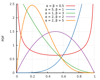
It’s defined between 0 and 1, making it perfect for modeling probabilities. But more importantly, it’s flexible. It can represent total uncertainty (where every rate is equally likely) or strong convictions, (where most of the probability mass is concentrated around a narrow range).
In Bayesian A/B testing, we use the Beta distribution to track our evolving belief about the conversion rate. Before the experiment, it reflects our prior assumptions. After we collect data, we update it to reflect the evidence.
Depending on what we know (or don’t), the shape of that belief curve can look very different. Here are a few examples:
The beta works naturally with the binomial distribution. When we update a Beta prior with binomial data, we get a Beta posterior. This property, called conjugacy, makes the updating process mathematically seamless. Our beliefs can change but the form of our model stays the same.
Say your experience as a product manager tells you that most new features tend to "convert" at around 10% of users. Rather than discarding that knowledge, Bayesian inference lets you incorporate it directly into your model by shaping your prior distribution to reflect it.
To incorporate that knowledge into our model, we use the Beta, which is controlled by two parameters: α and β. These parameters shape the curve and determine how confident we are in different conversion rates. The mean of a Beta distribution is:

So if we believe the true rate is likely around 10%, we can choose values of α and β that center the distribution at 0.10. For example, Beta(2,18) has a mean of 2/(2+18) = 0.10.
This is a way of saying: "Before seeing any data, I believe a 10% conversion rate is most likely, and I'm about as confident in that belief as if I had already seen 20 users, 2 of whom converted."
The notation Beta(α,β) simply tells us how that belief is distributed across the 0-1 range. Higher values of α and β mean stronger prior confidence; smaller values mean more uncertainty.
What the data tells us is that 27 out of 500 visitors convert for the Green button. To update our prior belief, represented by Beta(2,18), we simply incorporate the new evidence.
We do that adding 27 to α (for the conversions) and 473 to β (for the non-conversions). This gives us an updated posterior distribution:
Posterior = Beta(2+27, 18+473) = Beta(29,491)
Here's what that the graph looks like :
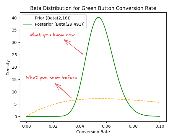
This posterior distribution combines what we believed before the test with the new evidence from the data. It now represents our current belief about the true conversion rate of the Green button.
We model the Blue button the same way.
Starting with the same prior belief, that Beta(2, 18), centered at a 10% conversion rate, we now update it based on the observed data: 23 conversions out of 500 visitors.
Adding 23 to α for the conversions and 477 to β for the non-conversions gives us the updated posterior for the Blue button:
Posterior = Beta(2+23, 18+477) = Beta(25,495)
Graphically:
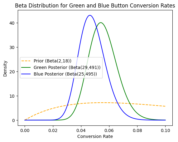
This new distribution reflects what we now believe about the Blue button’s true conversion rate, combining both our prior knowledge and the test data.
At this point, we’ve done something more powerful than produce two conversion rates. We’ve built two full probability distributions—one for each button. Each curve shows not just a single estimate, but a range of possible conversion rates, weighted by how plausible each one is, given both our prior belief and the observed data.
So instead of asking, “Is 5.4% greater than 4.6%?”, we’re asking a richer question: What do we actually believe about the true rate behind each button?
This isn’t something we can answer by comparing averages. Each distribution captures uncertainty, and those uncertainties overlap. What we really want to know is: if we drew one plausible value from each distribution, how often would Green outperform Blue?
There’s no simple formula for that, but the logic is straightforward. We can simulate the scenario: draw 10,000 samples from each distribution, compare them one by one, and count the fraction of times Green wins:

In our case:
 Graphically:
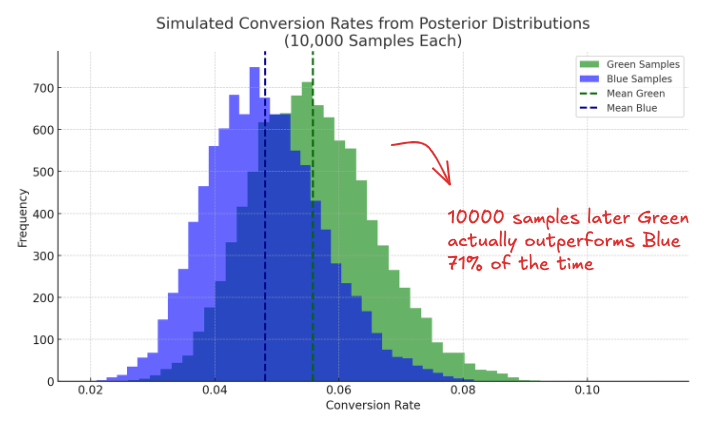
This gives you something far more useful than a p-value: Based on the data and your prior, there’s a 71% chance that Green truly outperforms Blue.
Now you’re not just picking a winner: you’re quantifying confidence, weighing upside, and sizing up the risk.
Which is the actual job.