I used to love two things about computers. The first was that they did exactly what you tell them to do. The second was that they did the exact same thing every time.
Humans shattered that magic. We now have AI assistants who do what you tell them to do, but they also do a lot of other things that you didn't tell them to do, and they do it differently every time.
When I started implementing AI assistants in our notebooks, I hated that. At times, the assistant would perfectly execute complex tasks like developing a churn prediction model but then stumble over something as simple as plotting a revenue line chart from a CSV of financial data.
At first, I thought I'd have to do something fancier than just RAG and "prompt engineering" to get the AI assistant to work. Then, I realized that I could get better results with a few UI tweaks, and this is what this blog post is about.
Setting good examples
The most useful mental model for implementing AI assistants is to think of yourself as a manager onboarding a new senior employee.
You wouldn't expect the new senior employee to know everything about your business on their first day, but you would expect them to be smart and capable of learning quickly. In other words, you assume zero knowledge and infinite intelligence.
I like that approach, and that's what most people do. Let's say they're building an assistant to help fifth-graders with their homework. In that case, most people would just do some kind of RAG over fifth-grade textbooks, and that would be it.
In our case, we did something similar. Initially, we fed the LLM with the content of the current SQL or Python block, the user's database schema, and a list of data frames, their columns, and their types.
That approach worked well, but one common complaint was that the LLM's output didn't follow the user's coding standards. For example, the user's previous code used plotly but the LLM used matplotlib. Or the user's code used a specific color palette, but the LLM would just default to the standard one.
To fix that, we started including a few code snippets from the notebook so that the AI assistant could see whether we were using matplotlib or plotly, and what colors users prefer.
Oddly enough, one of the most impactful changes we made was to include the document's title and the content of relevant text blocks if we had any. That way, the AI assistant could see what the user was trying to do, and suggest something that made sense in that context.
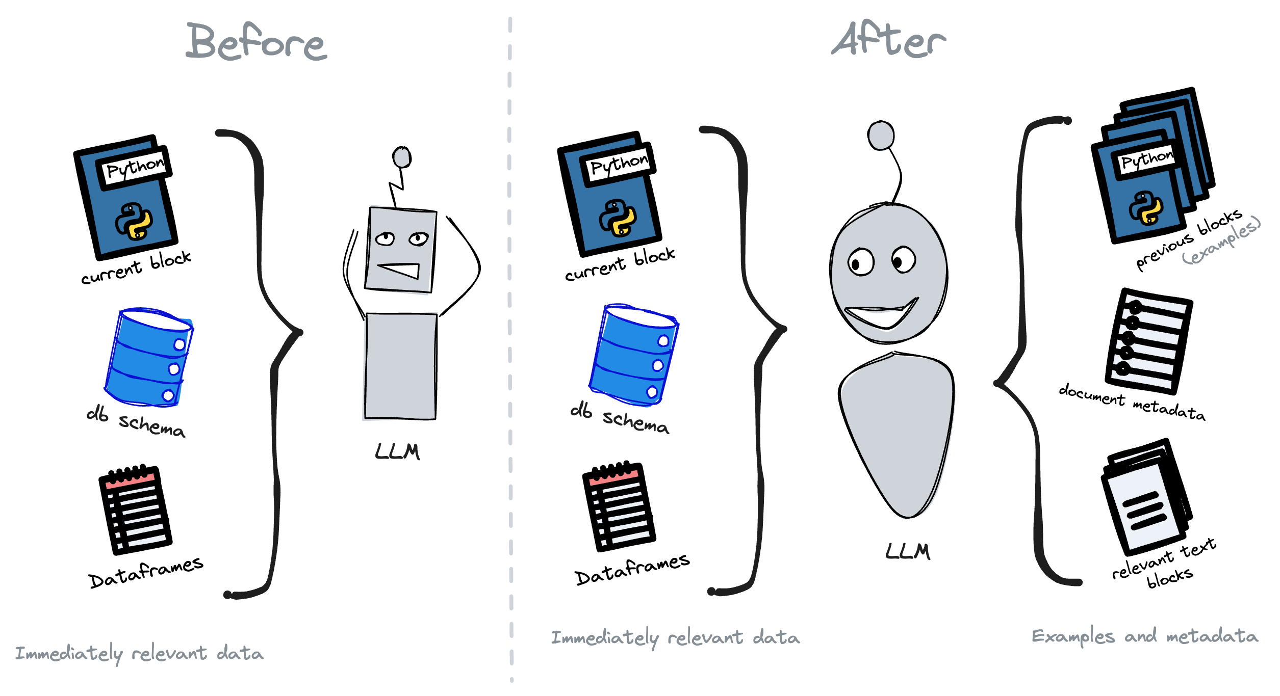
In a way, this approach mimics what a senior engineer does when they're submitting their first few pull requests. They look at the existing codebase, see what the team is doing, and try to follow the same patterns.
Encouraging small steps
Pull request sizes are usually inversely proportional to the wrinkles on a programmer's forehead. The more seasoned the programmer, the smaller the pull request.
That's because seasoned programmers know that the more code they write before getting feedback, the more code they'll have to erase if something is wrong.
Additionally, working on small steps at a time makes tasks easier to wrap your head around, and easier to debug.
The same principles apply to AI assistants. You should encourage users to give the AI assistant small tasks at a time and ask the user for feedback on each task before the assistant moves on to the next one.
In our case, we used to have an input for users to ask the AI to perform an entire analysis on their behalf. After a month or so, we removed it because we found that tasks got too large for the AI to handle at once, and too intricate for users to describe accurately.
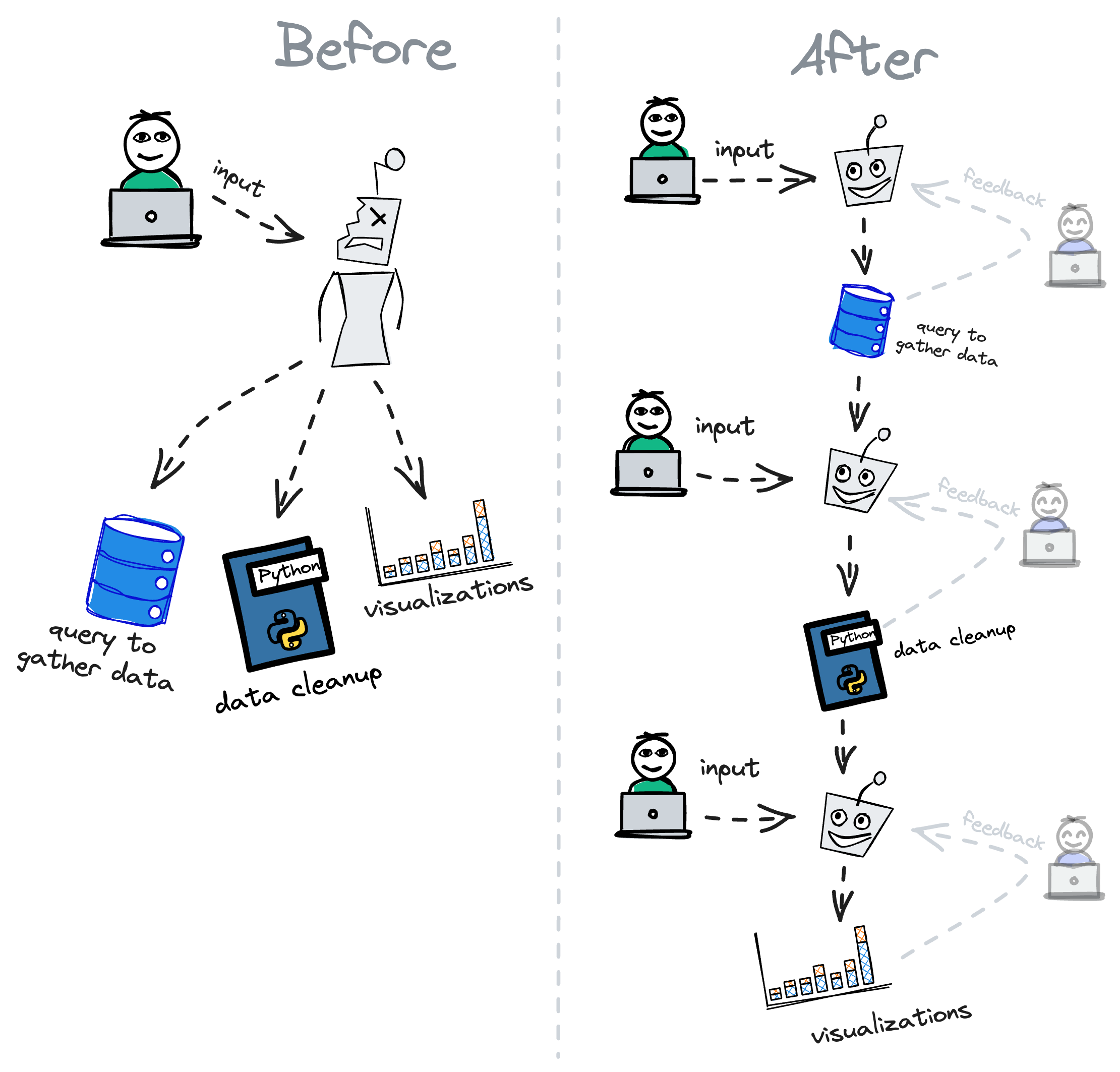
Now, we include AI assistants in individual blocks. That way, users end up asking the AI to do a single step at a time.
Consequently, user's prompts usually get more accurate, because they don't have as many intricacies to describe and thus tend to devote more time to crafting a better prompt.
A further benefit of encouraging small steps and getting feedback on each is that the user gets to vet each suggestion before moving on to the next one. That way, the assistant's corpus gets more accurate over time, and the user gets more comfortable with the assistant's suggestions.
Optimizing for feedback
When asking users to take small steps, you must make each step as fast and pleasant as possible. Otherwise, users will get frustrated and give up.
In our case, for example, we used to have the AI replace the user's code with its suggestions, and we'd do it all at once. That was a terrible idea because users couldn't tell whether the AI was working until it was done, and they couldn't see what the AI was doing until it was too late.
To fix that, we did three things.
First, we started streaming the AI's response instead of emitting it all at once. That way, users could see the AI's suggestions as they were being generated, and they could stop the AI at any time if they didn't like what they were seeing.
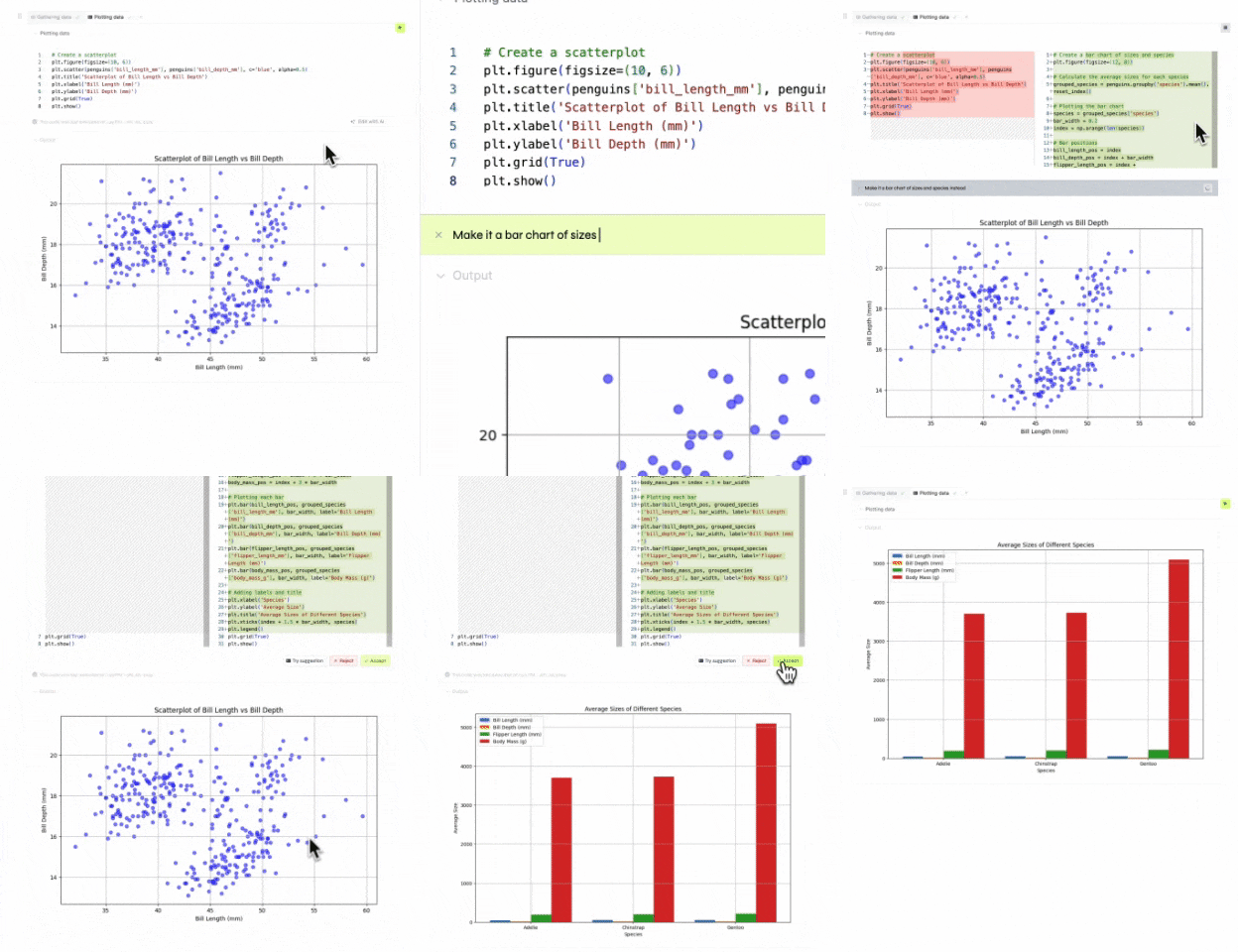
After that, we started showing the user a diff of what the AI assistant suggests. Then, they could accept or reject the changes. That way, users could clearly see what the AI assistant was suggesting versus what they wrote.
Finally, we added a button that allowed users to try the AI assistant's suggestion without accepting it. That way, users could try the suggestions before accepting them, and they could also modify the diff in case something was slightly off.
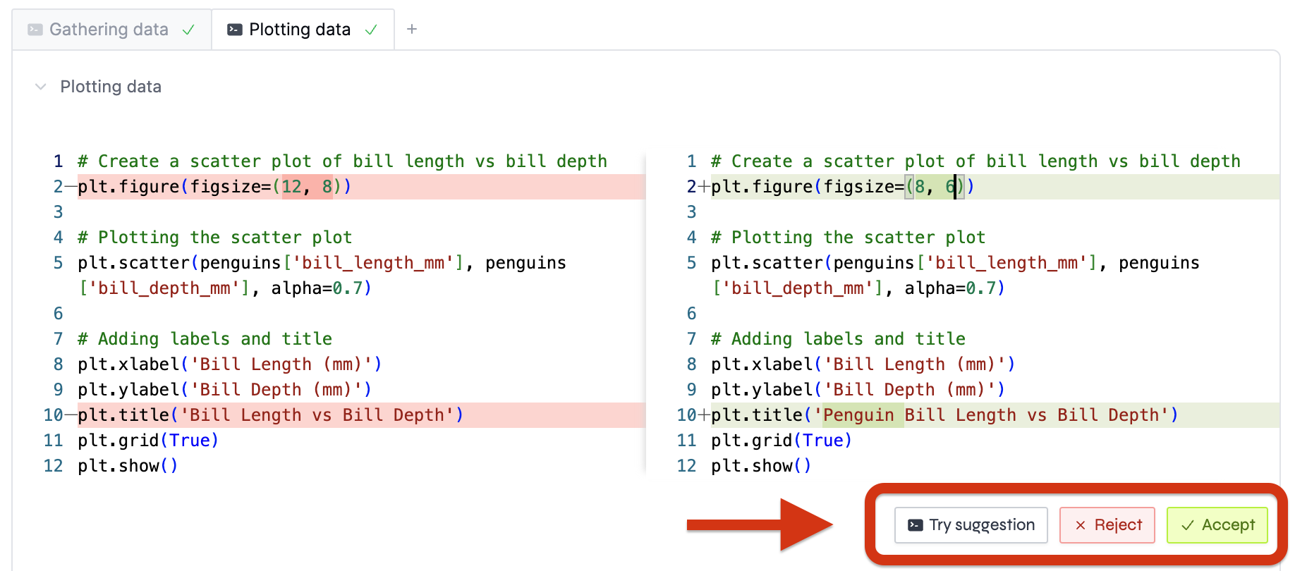
Something else we're working on is to allow users to prompt the AI assistant's suggestions without having to accept them.
In addition to making each step more seamless, these diffs also prevent users from running undesirable code as it puts on them the burden of reviewing each change.
Encouraging action
Clicking a button is quicker than writing a prompt, and it's also more intuitive. Consequently, you should consider adding a "quick trigger" button whenever there's an action that the assistant can take without the user having to prompt it.
In our case, errors are a prime example of that.
Whenever someone writes invalid SQL or makes a typo in their Python code, the error that comes up usually has all the necessary information for the AI assistant to fix it. Therefore, there's no need to ask the user to prompt the AI assistant to fix it.
Instead, we show a button that says "Fix with AI". When the user clicks it, we feed the LLM with the error message and a bit of context, and we ask it to try to fix it.
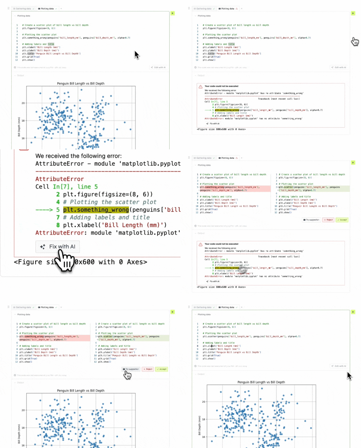
These types of scenarios are more common than you'd think, and they're a great opportunity to show users the value of the AI assistant. People will trigger the assistant more often if they don't have to think about what to do with it.
Models usually take care of themselves
Finally, one last piece of advice is to assume that new LLMs will only get better, faster, and cheaper over time.
Take GPT-4o, for example. When it was released, it solved quite a few problems we had with the previous versions. All of a sudden, our default assistant got way faster and more accurate.
The trick is that we didn't have to do anything to make that happen. Had we spent months fine-tuning models and squeezing every last drop of performance out of them, we would've wasted a lot of time.
Instead, we focused on making the user's experience as good as possible, and we let the LLM's performance take care of itself.
Then, when a new model came along, we could just plug it in and get better results without having to change anything else.
In comparison, everyone else who spent months working on their models had an assistant that was just as good as ours, but without all the UI improvements we had made.
Putting it all together
Perceived performance is the only performance that actually matters. If users perceive your assistant to the better, it doesn't matter whether its underlying model is the one with the highest scores on standard benchmarks.
In a way, making AI assistants better is as much about improving the models as it is about improving the user's experience when using them.
Sure, there's a lot of value in creating better models, but there's a lot more innovation you can do if you focus on the specific problem you're trying to solve.
Consequently, if you're adding AI features to your product, you should probably start with the low-hanging fruit: UI/UX improvements.
Here's what we found helpful:
- Set good examples: instead of including only raw data, augment generation with user-generated examples and specific context.
- Encourage small steps: ask users to prompt the AI assistant on small tasks at a time, and ask for feedback on each task before moving on to the next one. Then, use each step's result to improve future suggestions.
- Optimize for feedback: make each step as fast and pleasant as possible, and make it easy for the user to adjust the assistant's suggestions.
- Encourage action: add a "quick trigger" button whenever there's an action that the assistant can take without the user having to prompt it.
