
Confidence intervals help us know more about the world, even when we can’t see all of it.
Say ou want to answer a simple question: how many slices of pizza can a person eat in 30 minutes?
How would you figure that out on your own?
Sure, you could make every person on the planet eat pizza for 30 minutes and calculate the global average. But unless you’ve got a few billion dollars and an industrial cheese pipeline, that’s not happening.
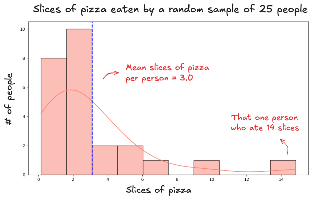
Instead you take a sample. You gather a group of people, feed them pizza, and measure what happens. So you try it. You randomly select 25 people, give them pizza, and record the results. The average comes out to 3 slices per person. Here's what that sample looks like:
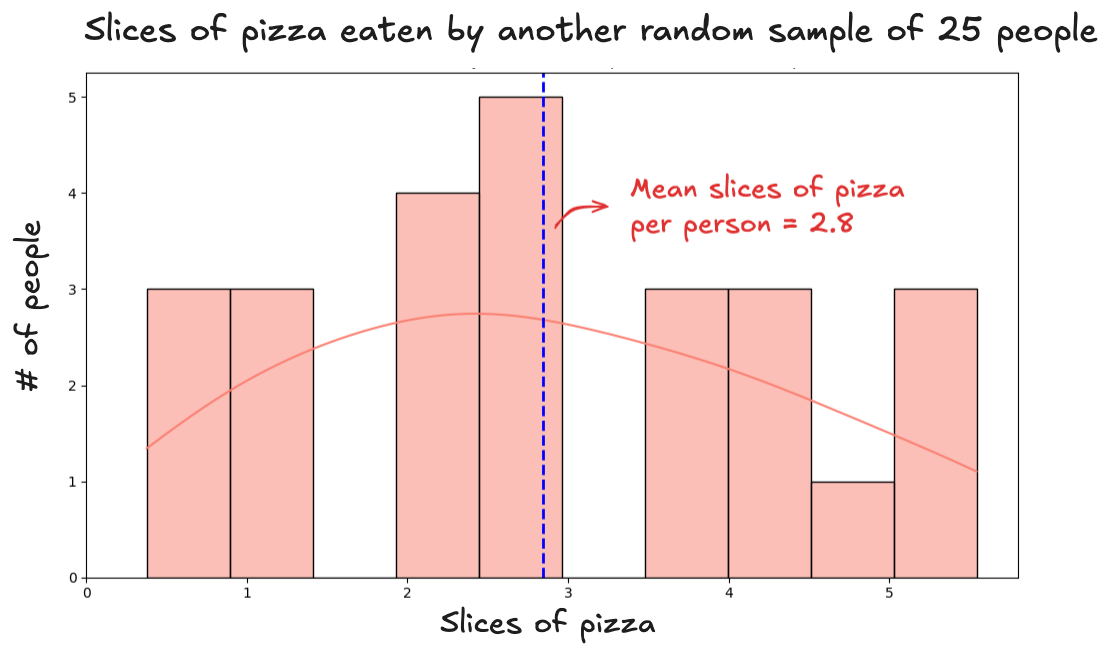
To be sure, you run the experiment again. You take a new group of 25 people, give them the same 30-minute pizza challenge, and this time, the average comes out to 2.8 slices:
Before running the experiment a third time, you stop and think: Am I even close to the truth? Those two averages (3 and 2.8) seem reasonable. But are they right? Can a single group of just 25 people really tell us something meaningful about the entire population? And if so, under what conditions does that actually work?
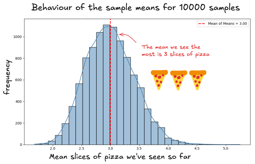
To start answering that, let’s look at how the averages (the sample means) behave. So far, we’ve got two of them, each from a different group:
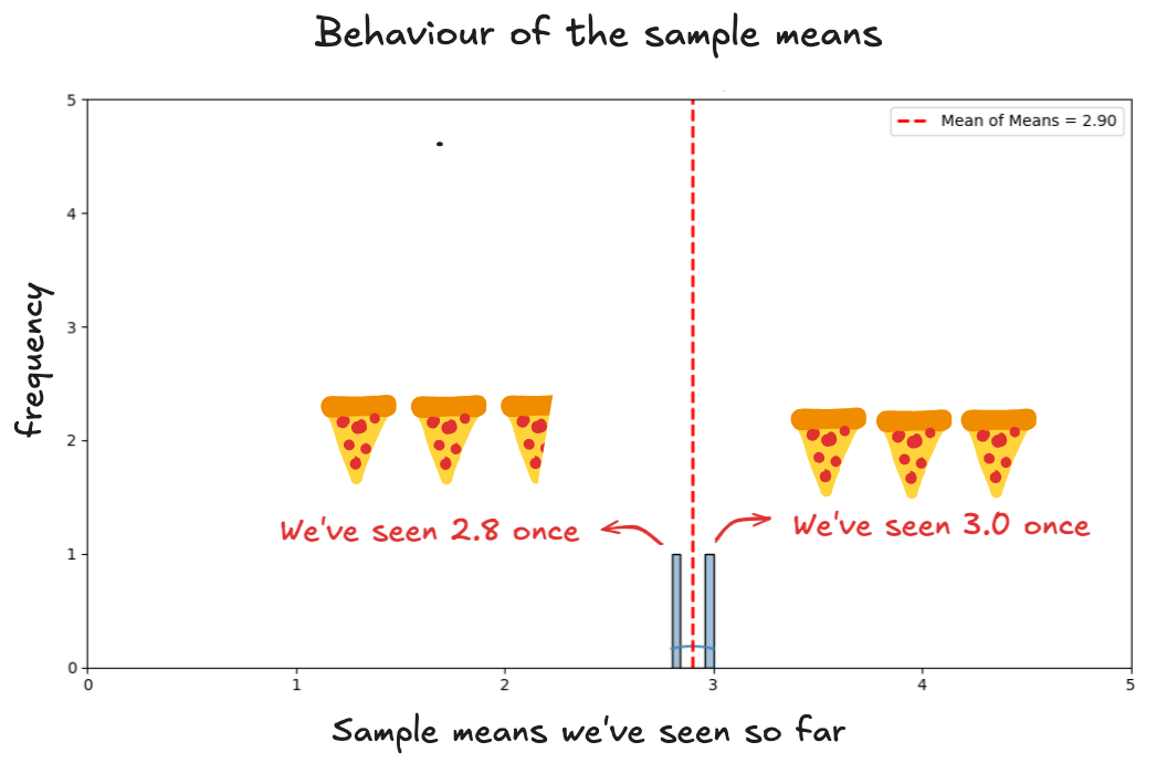
The averages are landing in a similar range. That seems reassuring.
But how do we know they’re actually good estimates? After all, each one is based on just a handful of people. What if we just got lucky? What if the average is inflated because we happened to sample a group full of mukbang YouTubers?
That’s a fair concern, and it’s why randomness matters. We're assuming our samples are random, meaning everyone in the world had an equal chance of being picked. That’s the starting point. Without randomness, the whole experiment is off course before it begins. Randomness is what keeps the selection fair and protects us from bias.
Still, you might wonder: couldn’t a sample land at an extreme just by chance?
Technically, yes. But let’s think about what that would take.
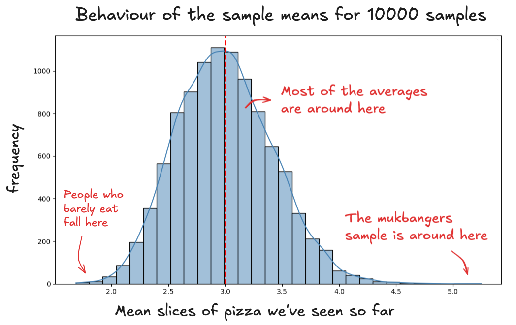
To get a sample average as high as the most extreme pizza eater on Earth, your entire group would need to be made up of mukbang stars. Not one or two — all 25. Every single person in the sample would have to be a professional eater. That’s not impossible. But it’s very unlikely. The result? A histogram with a sky-high average. Something like this:
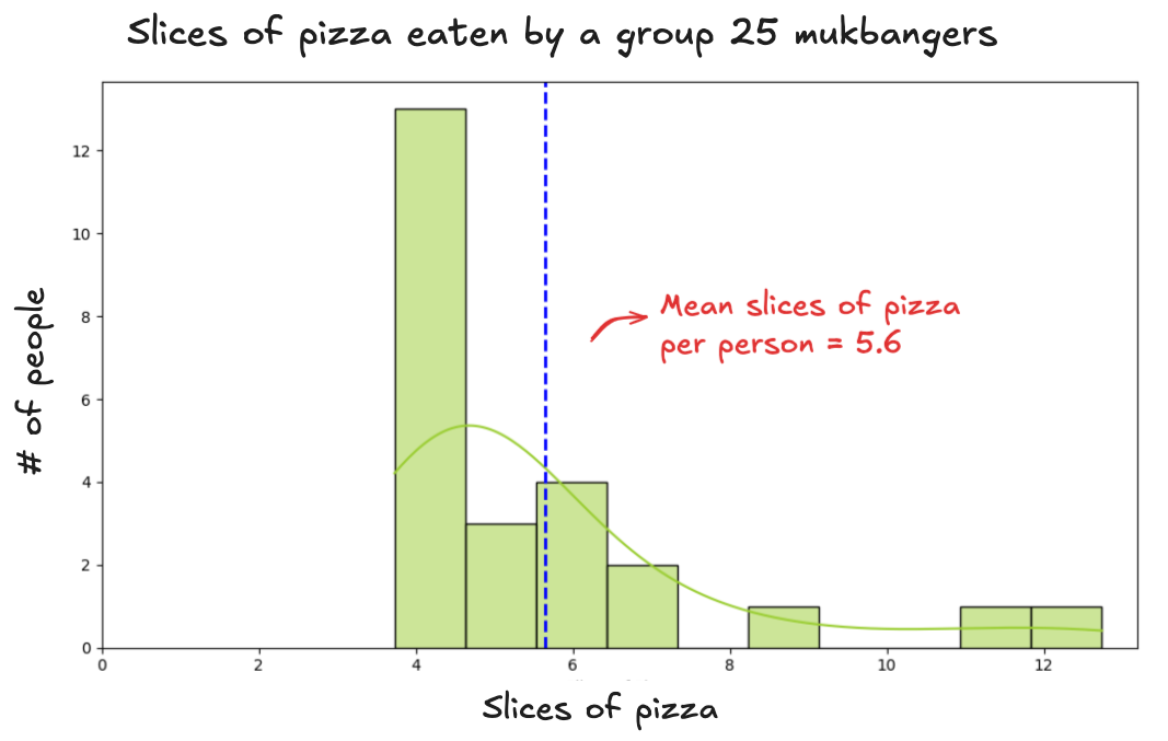
This sample gives us an average of 5.6 slices per person. Where does that number sit in the bigger picture?
If we repeated this process 10,000 times, each time randomly picking 25 people and calculating their average, most of those results would fall near the center. This is what that distribution would look like in our case:
When you repeat the sampling process over and over, the typical results win. They happen again and again. They show up more often. The rare stuff? Not so lucky.
You might randomly draw a sample with 25 mukbangers once (maybe twice if you're cursed) but those extremes don’t get reinforced. They don't pile up. They stay stranded out on the edges of the distribution.
The same goes for the other extreme. To get a very low average, you'd need to randomly select only people who barely eat pizza. Again, very rare.
The extremes cancel each other out, and that tug-of-war pulls the average toward the middle.
This is where this outliers fall into in the distribution:
You might have noticed the distribution of the sample means forms a shape. It’s smooth, bell-like, and centered. That’s the normal distribution curve.
But where does that shape come from? Does the distribution of everyone’s pizza-eating ability also look like that?
Not necessarily. The bell curve shows up because we’re averaging. It’s a feature of how sample means behave, not a mirror of how individuals actually eat.
To see the difference, imagine we had data on all 8 billion people on Earth. If we plotted how many slices each person eats in 30 minutes, we’d get the population distribution: the full spectrum of eating habits, from nibblers to mukbang stars.
It looks something like this:
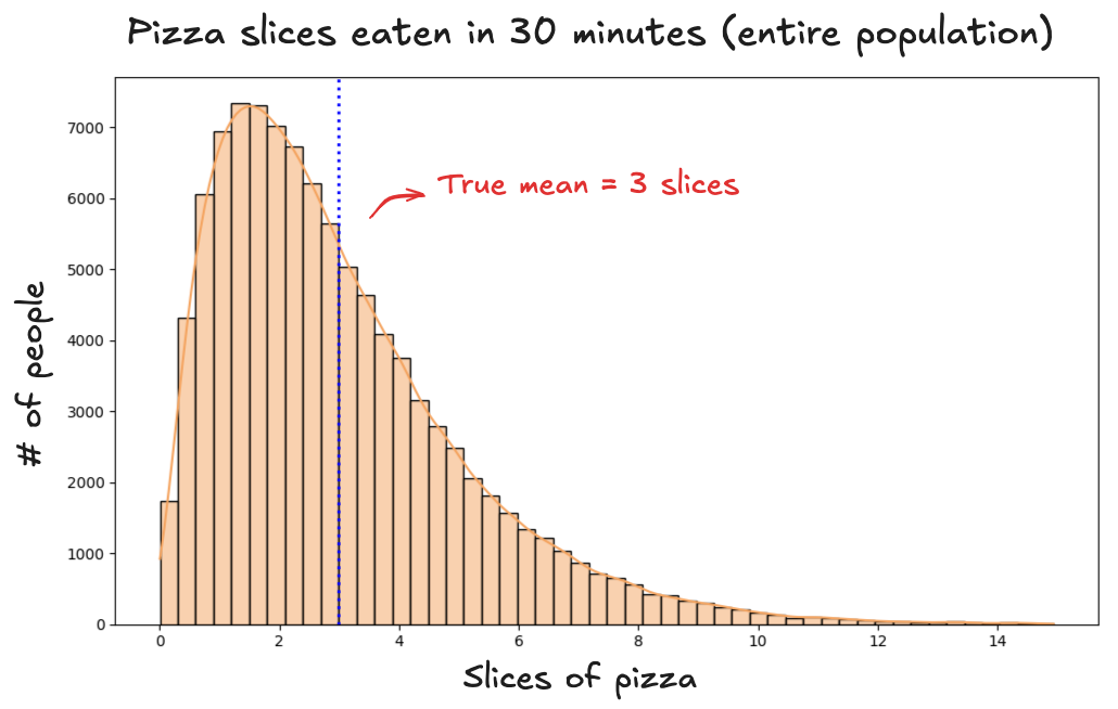
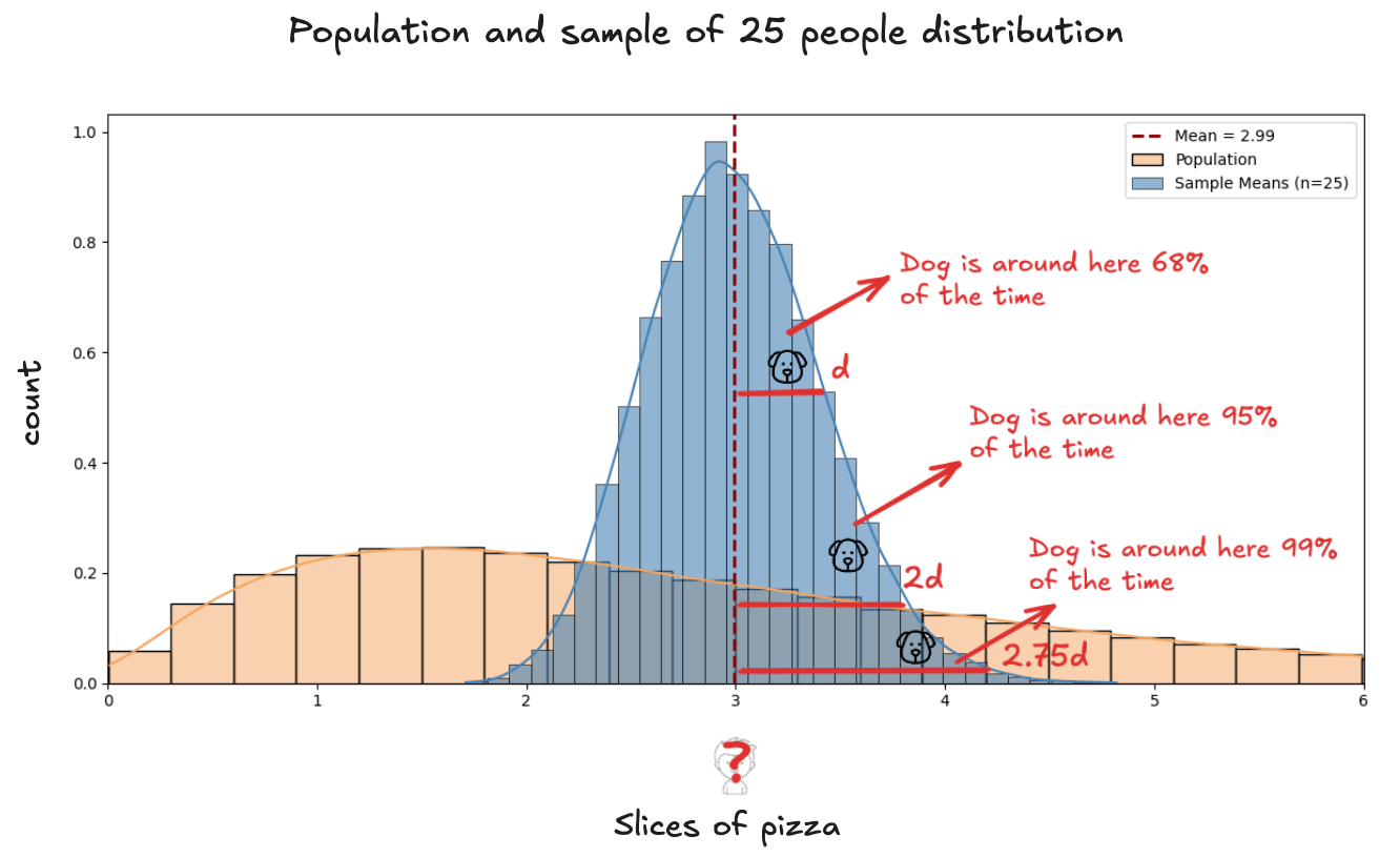
The distribution is far from tidy. It’s right-skewed, with most people clustered around 2 or 3 slices, and a long tail stretching toward the outliers, the few who manage 8, 10, even 14 slices. And yet, when we take random samples from this messy population, something remarkable happens: the sample means arrange themselves into a clean, symmetrical curve.
Even when the population is messy, the distribution of sample means still forms a clean, bell-shaped curve. In other words: no matter how unpredictable the population is, the averages behave predictably.
Not only that, the sample means we observe vary around the true population mean. In our case, that mean is slices.
This isn’t just a fluke. No matter what the population looks like, the distribution of sample means forms a normal curve, centered on the value we want to estimate. This is the Central Limit Theorem, a foundational idea in statistics. It was observed long before it was formally proven: take enough random samples, and the averages begin to behave predictably.
If we place the population distribution and the distribution of sample means side by side, here’s what we see:
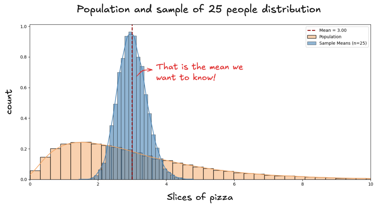
We can see the sample means clustering around the population mean. In other words, we know that, most of the time, our sample mean lands within some distance of the true value we’re trying to estimate.
And since the sample means follow a normal distribution, we can apply all the properties that come with it. Specifically:
-
About 68% of the time, our sample mean will be a distance d from the true mean.
-
About 95% of the time, our sample mean will fall within 2 times this distance.
-
About 99% of the time, our sample mean will fall within 2.57 this distance
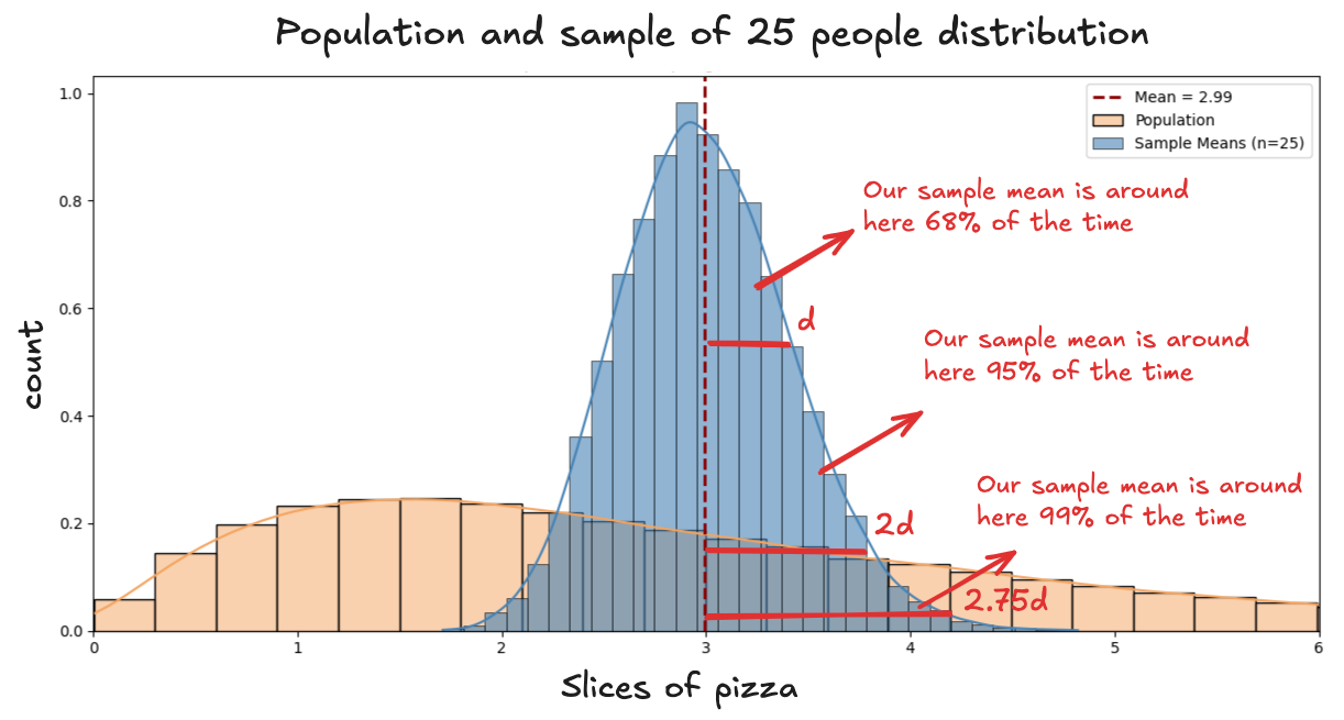
This distance is the typical amount the sample mean strays from the population mean. In our pizza contest, it’s how far the average from a group of 25 people might wander from the true average you'd get if you could feed everyone on Earth.
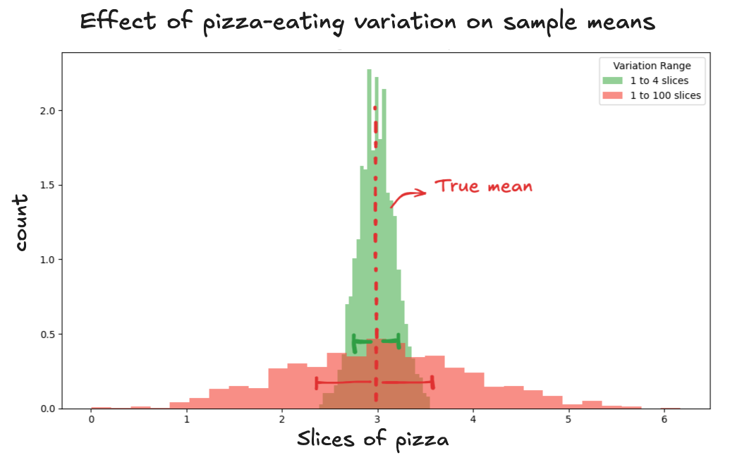
It depends on two things: how wildly appetites vary, and how many people you include in your sample.
When it comes to people's appetites, the more variation there is, the farther the sample mean can stray. If some people eat 1 slice and others devour 100, the average can swing wildly. But if nearly everyone eats between 2 and 4 slices, the averages settle down. The distance can be shorter (green threshold). But if nearly everyone eats between 2 and 4 slices, the averages settle down. The distance can be shorter (green threshold).
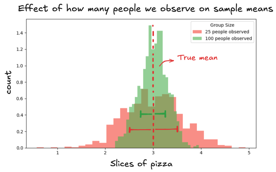
When it comes to the number of people in your sample, the more you include, the less the sample mean wiggles around.
On the other hand, with a smaller group, say 25 tasters, the sample mean can land high or low depending on who ends up in the group (red threshold). With 100 tasters, the randomness evens out. The extreme eaters and light eaters balance each other better, so the sample mean doesn't move around as much from sample to sample (green threshold).
That distance is called the Standard Error of the Mean. It tells you how much you should expect your sample mean to wiggle just by chance. It’s a way to measure how much your sample mean might differ from the true mean you’re trying to find.
So once you calculate the mean of your sample and know how far it tends to stray (the standard error) from the true mean, you can say:
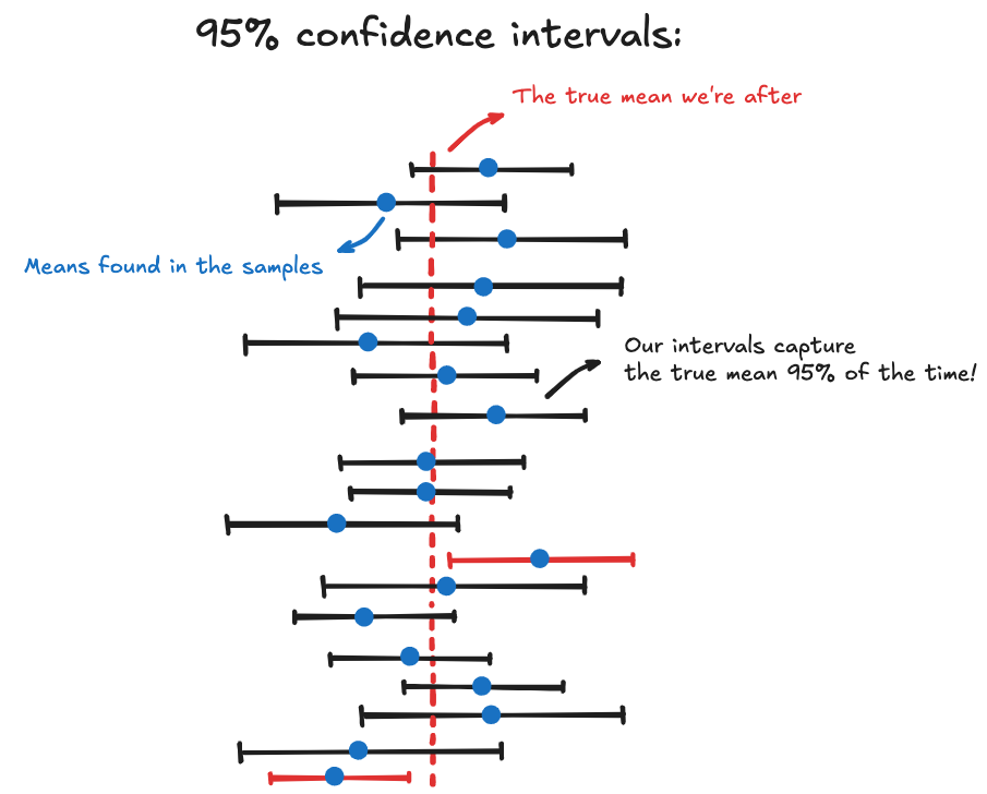
I’m 95% confident that the true population mean lies within this range.
This doesn’t mean there’s a 95% chance the true mean is in this interval. The true mean is fixed: it either is or isn’t in there. A confidence interval tells you how reliable your method is.
If you repeated the process many times: took new random samples and asked how many slices of pizza each person eats; then 95% of the intervals you build would contain the true average, which in this case is 3 slices. Visually:
Thanks to the Central Limit Theorem, we know how to find the true mean, because we understand how the sample means behave. No matter how messy the data is, the sample means form a normal curve, and they tend to cluster around the true mean.
We also have a way to measure how far the sample means usually wanders: the Standard Error of the Mean tells us how much sample means typically vary from the value we’re trying to find.
There's a tradeoff
Now you might be thinking: If a confidence interval only reflects the reliability of the method, and not whether this specific interval captures the true value, then what’s stopping me from claiming anything I want with 99.999% confidence?
Sure. You could say: "I’m 95% confident people eat between 1 and 1,000 slices of pizza in 30 minutes."
Technically, that’s valid. The interval is so wide, it almost guarantees the true mean is inside. But it’s also useless. It tells you nothing.
There’s a tradeoff.
You can always make the interval wider to boost confidence, but the wider it gets, the less helpful it becomes. On the other hand, if you make the interval too narrow, you might miss the truth entirely.
A good confidence interval strikes a balance. It’s wide enough to be reliable, but narrow enough to be meaningful. That's when a confidence interval becomes a tool for reasoning; one that reflects both what you know, and how well you know it.
The Dog, the Boy, and the Mean
To sum up: if you want to understand confidence intervals, picture a boy and his dog.
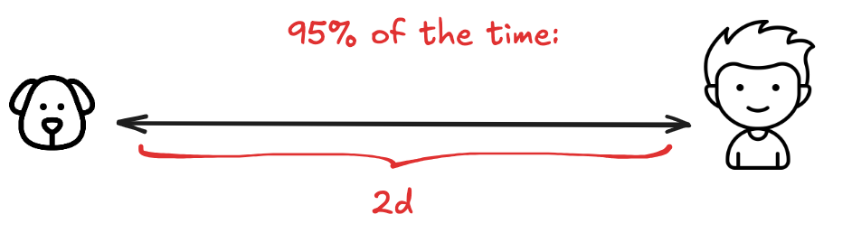
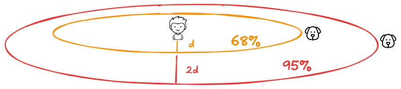
The boy walks the dog every day through the neighborhood. The dog is obedient, leash-free, and curious. He drifts, but is never too far. You begin to notice a pattern: roughly 68% of the time, he’s within a certain range; 95% of the time, within twice that range.
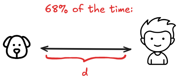
So when you see the boy, it’s easy to guess the dog is nearby. The boy is the center, and the dog loops loosely around him.
Now flip the scene.
One day, you don’t see the boy. You see only the dog.

You pause, look around, and say: "The boy must be right about... there." The catch is: you never had to see the boy at all.
By watching the dog again and again, you learned how far he tends to stray. So now, even in a single moment, a lone observation tells you something meaningful about what you can’t see.
This is the logic behind a confidence interval.
What we’re really after is the real average, the number you’d get if you could somehow ask every person on Earth how much pizza they eat in 30 minutes. That number exists, but we can't measure it directly. That number is the boy. And right now, we can’t see him.
So instead, we watch the dog. Each time we randomly pick 25 people and calculate their average, it's like taking a snapshot of where the dog is. That number (3.0 or 2.8) is a single frame. A moment in time.
Knowing where the dog is help us find the boy thanks to the Central Limit Theorem, which tells us how he drifts from the boy. Visually:
Confidence intervals are valuable because we usually have to reason with limited information. You can’t see the boy (the true mean) directly. But if you understand how the dog (your sample mean) tends to move, you can make solid guesses about where the boy is.
That’s what inference is: You don’t need the exact truth, just how far off you might be.
A confidence interval gives you that range. It tells you: Here’s what I observed, here’s how much it might vary, and how sure I am about it.
Between the dog and the boy, or between the data and the truth, that’s where statistics does its work.