
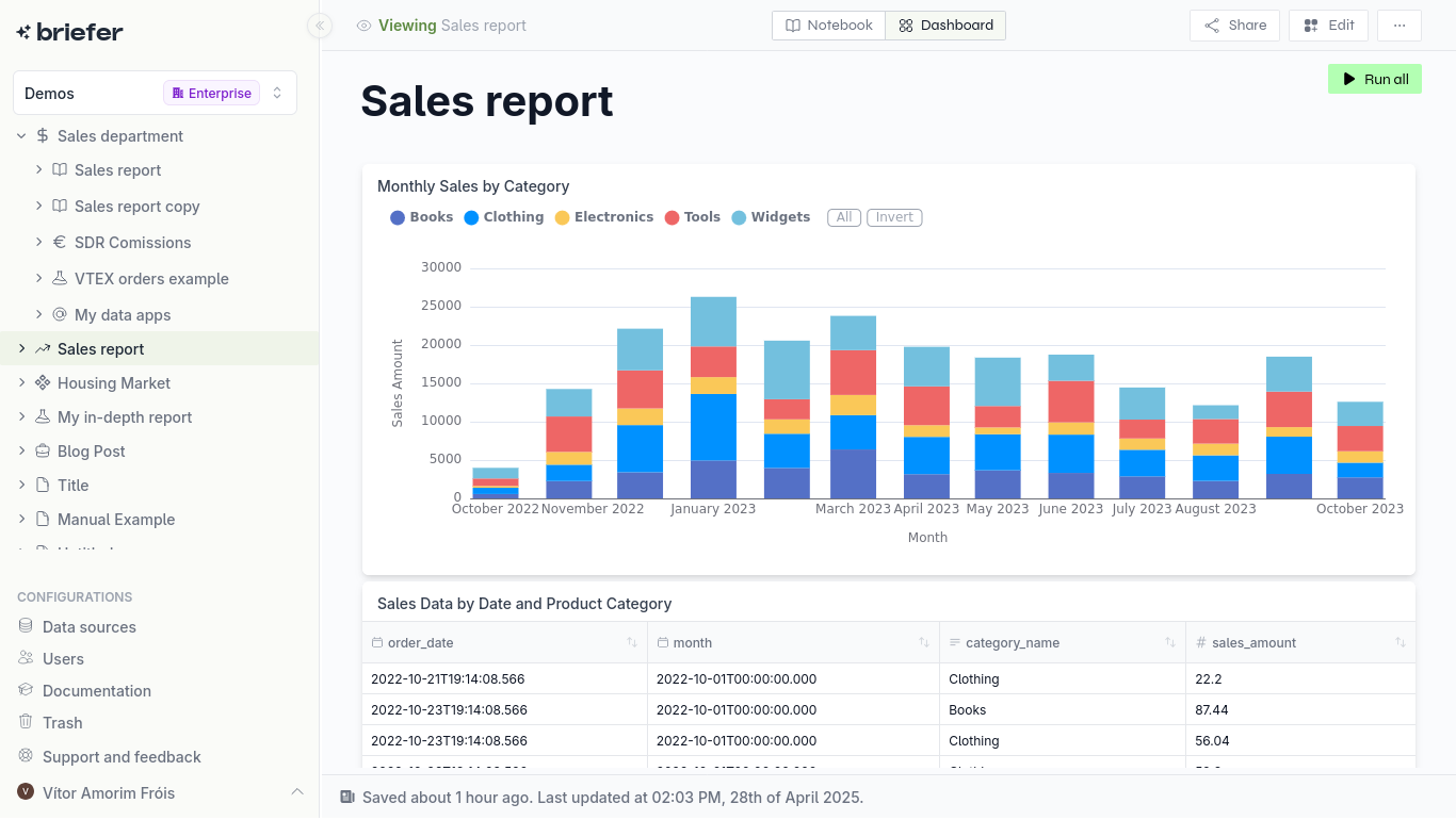
Dashboards are for monitoring what you know. Exploratory Data Analysis (EDA) is for discovering what you don’t. This post explores EDA principles, techniques and its critical role in data-driven decision-making using modern tools.
Table of Contents
- Introduction
- The Traditional Challenges of EDA
- The Modern EDA Workflow
- Key Techniques & Best Practices
- Briefer EDA Use Cases
- FAQs
- Conclusion
Exploratory Data Analysis: An Introduction
A dashboard tells you that sales are down; EDA tells you that sales are down in a specific region, for a specific product, and only for customers who used a discount code. It’s the difference between seeing the “what” and understanding the “why.” This post is about how to do the latter, and why the tools you use are probably holding you back.
What is Exploratory Data Analysis (EDA)?
Exploratory Data Analysis (EDA) is the process of digging into a dataset to understand it. Forget formal hypothesis testing; this is about developing an intuition for the data. Coined by John Tukey, it’s the initial, open-ended investigation of your data’s structure and patterns. It’s less about finding answers to specific questions and more about figuring out which questions are worth asking in the first place. You’re looking for outliers, spotting weird distributions, and getting a feel for the relationships between variables before you commit to building a model or a report.
Analysts and engineers often get bogged down in whether EDA is a rigid, step-by-step process or a free-form art. The truth is, it’s both. You need the discipline to systematically check for things like nulls, data types, and basic statistical summaries. But you also need the curiosity to pull on a thread when you see something odd: a weird spike in a histogram or a correlation that makes no sense. The goal isn't to produce a polished dashboard; it's to have a candid conversation with your data to uncover its underlying reality, warts and all.
Why EDA is Critical for Modern Data Teams
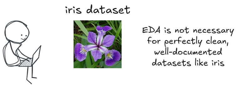
There’s a constant pressure to move faster, to get to the modeling, to show results. This pressure often leads to the question: is EDA a waste of time? For a perfectly clean, well-documented dataset like iris or titanic, maybe. But for real-world data, skipping EDA is professional malpractice. It’s the work that prevents you from building a model on faulty assumptions, from presenting a chart that’s plain wrong, or from spending six weeks on a project that could have been invalidated on day one.
Every experienced scientist tell war stories about the time EDA saved them. It’s the process that uncovers the fact that sensor data was corrupted for a two-week period, that a key categorical variable is riddled with typos, or that the distribution of your target variable is completely different than what the business believes. Sometimes, the most valuable insight from EDA is that the project isn’t feasible or that the data can’t answer the question being asked. That’s not a failure; that’s a massive win, saving countless hours of wasted effort.
Ultimately, EDA is the firewall between your analysis and the messy reality of the data. It’s the process that builds the institutional knowledge required to work with a dataset effectively. It’s not about making pretty charts; it’s about understanding the raw material you’re working with. In many cases, the exploration is the analysis. A few well-chosen plots can often answer a business question more effectively than a complex model ever could.
The Traditional Challenges of EDA: A Fragmented & Frustrating Workflow
If EDA is so critical, why is it so often neglected? Because the traditional workflow is a nightmare. It’s a fragmented, frustrating process that forces analysts to spend more time fighting their tools than exploring their data.
The EDA Challenge: Why Your Current Setup Slows You Down
This isn't a smooth process; it's a challenge. Analysts are forced to run through a series of disconnected applications, each with its own interface, its own data model, and its own set of limitations. This isn't just inefficient; it's actively hostile to the kind of deep, focused work that EDA requires.
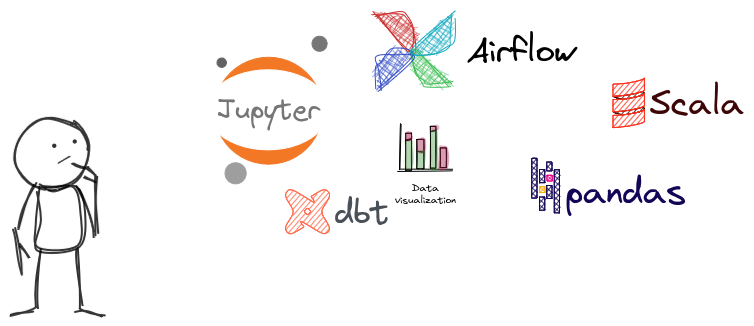
The Tool-Switching Penalty in EDA
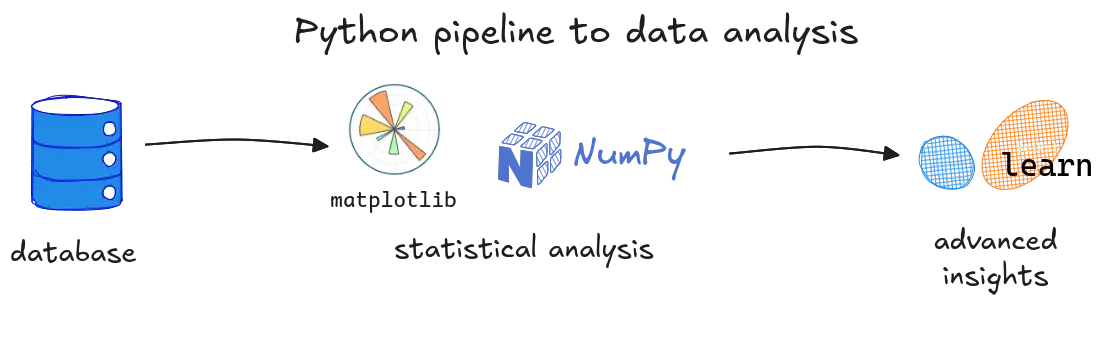
The default workflow for most analysts is a challenge of context switching. You start in a SQL client (DBeaver, DataGrip) to pull data. Then you’re off to a Jupyter Notebook for wrangling with Pandas. Next, you’re coding up visualizations with Matplotlib or Plotly. Then you might move to a BI tool like Tableau or Looker to make a dashboard. Finally, you’re documenting the whole mess in Confluence or Notion. Each arrow in that workflow is a point of friction, a mental reset that kills momentum. It’s a productivity tax that compounds with every step.
The core issue is that each tool speaks a slightly different language and operates on a different snapshot of the data. The analyst becomes a human data-integration pipeline, responsible for ensuring that the query, the code, the visualization, and the documentation are all in sync. It’s tedious, error-prone work that distracts from the real goal: understanding the data.
Collaboration Friction & Reproducibility Roadblocks
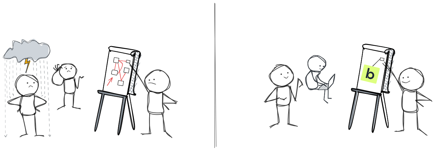
The solo data analyst is a myth. Analysis is a team sport, but our tools often force us to play alone. The friction starts the moment you need to share your work. How do you show a project manager your Jupyter Notebook? You can’t. So you take screenshots, paste them into a slide deck, and lose all the interactivity. The conversation becomes a one-way presentation, and the feedback loop is broken.
This leads to a bigger problem: the reproducibility crisis isn’t just for academics. It’s happening in every company, every day. An analysis is only useful if it can be trusted, and it can only be trusted if it can be reproduced. But when the query lives in one tool, the code in another, and the results in a third, reproducing an analysis is a forensic exercise. Even with version control like Git, analysts often end up with a mess of conflicting notebooks and scripts. There’s no single source of truth, which means there’s no real trust in the results.
The Modern EDA Workflow: How Briefer Unifies Your Exploration
The pain of the traditional EDA workflow is a sign of a tooling problem, not a methodology problem. The solution isn’t to do less exploration; it’s to use tools that are actually designed for it. A modern EDA workflow collapses the fragmented toolchain into a single, integrated environment, allowing analysts to stay in the flow and focus on what matters: the data.
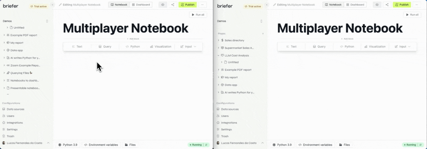
Briefer: Your Integrated Hub for Seamless EDA
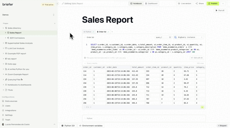
Briefer is built to solve the frustrations of the traditional EDA workflow. It’s a single, cohesive environment that brings together SQL, Python, visualization, and documentation, eliminating the need for the constant context-switching that kills productivity.
Collapsing the Workflow: From Query to Insight, All in One Place
With Briefer, the entire EDA process happens in one place. You can write a SQL query to pull data from your warehouse, then immediately use Python to manipulate it, and then generate an interactive visualization—all within the same notebook. There’s no need to export CSVs, switch windows, or manually sync results. This creates a seamless, uninterrupted workflow that allows you to iterate quickly and follow your curiosity.
This is the core of what a modern data analysis tool should provide: a tight loop between question, code, and insight. By removing the friction of the traditional workflow, Briefer allows you to spend more time thinking about the data and less time fighting with your tools. This is how you move from a process that takes hours to one that takes minutes. You can learn more about how AI is changing data analysis here.
AI as Your EDA Pair Programmer
To further accelerate the process, Briefer integrates a powerful AI assistant that acts as a pair programmer for the analyst. This assistant can help generate complex SQL queries from prompts, use Python libraries for data manipulation, and suggest the most effective chart types for a given dataset. This AI partnership helps analysts overcome writer's block, automate repetitive tasks, and learn new techniques, significantly speeding up the entire EDA process from start to finish.
Transparent & Reproducible EDA by Default
If you’ve ever tried to re-run a colleague’s Jupyter Notebook, you know the pain. Out-of-order execution creates a “hidden state” that makes a linear, top-to-bottom run of the notebook a fantasy. A famous study found that only 4% of notebooks on GitHub were fully reproducible. This isn’t just an academic problem; it’s a business problem. If you can’t reproduce an analysis, you can’t trust it.
In Briefer, the notebook is a first-class citizen, not an afterthought. The entire analysis—from the SQL query to the Python code to the final visualization—is a single, linear document. There is no hidden state. When you re-run the notebook, you are re-running the entire analysis from scratch, ensuring that the results are always consistent and up-to-date. This makes reproducibility the default, not a difficult best practice that no one has time for.
Collaborative Exploration for Both Technical & Business Users
Data analysis is a team sport, but traditional tools force the players onto different fields. The analyst works in a code-based world of notebooks and scripts, while the business user lives in a world of dashboards and slide decks. This creates a communication chasm that is notoriously difficult to bridge. The analyst exports a chart as a PNG, the business user gives feedback on the static image, and the analyst goes back to the code to make changes. This is not collaboration; it’s a game of telephone.
Briefer is designed to bring everyone onto the same field. An analyst can build a sophisticated analysis using SQL and Python, and then share a link to the interactive notebook with a business user. That user can then explore the data themselves, using filters and controls to slice and dice the data without writing a single line of code. This turns a one-way presentation into a two-way conversation, allowing for a much richer and more effective collaboration.
Key Techniques & Best Practices for Effective EDA with a Modern Data Stack
Effective EDA is both an art and a science. It requires a structured approach to ensure all critical aspects of the data are examined, combined with the flexibility to pursue unexpected avenues of discovery. When powered by a modern data stack, this process becomes even more powerful, enabling deeper insights at a faster pace.
Essential Steps in EDA
A thorough EDA workflow can be broken down into several key stages, each building upon the last to create a comprehensive understanding of the dataset.
Data Understanding & Profiling
The first step in any analysis is to get a high-level overview of the data's structure and characteristics. This involves a basic but crucial check of dimensions (rows and columns), data types for each variable (e.g., integer, string, timestamp), and the volume of missing values. This initial profiling acts as a foundational assessment, helping you grasp the scale and composition of your dataset before diving into more complex analysis. It’s the equivalent of checking the table of contents before reading a book—it sets expectations and provides a map for the exploration ahead.
Once you understand the basic structure, the next step is to compute descriptive statistics to get a quantitative summary of the data. Calculating measures like mean, median, standard deviation, and quartiles for each numerical variable provides a snapshot of its central tendency and spread. This is often the first point where you can spot potential red flags, such as a minimum value that doesn’t make sense (e.g., negative age) or a standard deviation that seems unusually high. These statistical summaries are critical for guiding your next steps, as they highlight which variables might require cleaning or more detailed investigation.
Data Cleaning & Preprocessing
With a preliminary understanding of the data's potential issues, the focus shifts to cleaning and preprocessing. Raw data is almost never perfect; it often contains outliers from entry errors, inconsistencies in categorical data (e.g., "USA" vs. "United States"), or structural problems that can corrupt your analysis. Addressing these issues is a critical step to ensure the integrity of your findings, as even a small percentage of bad data can lead to misleading conclusions and flawed models.
This cleaning process is rarely a one-time task but rather an iterative loop between identification and correction. A central challenge is deciding how to handle missing values: should you remove the records, or should you impute them with a mean, median, or more sophisticated estimate? The right choice is highly contextual and depends on the nature of the data and the reason for its absence. A null value in one column might signify a zero, while in another, it could indicate a malfunctioning sensor, making this stage a blend of technical execution and analytical judgment.
Univariate & Bivariate Analysis
After cleaning the data, the core of the exploration begins with analyzing one variable at a time, known as univariate analysis. The goal is to understand the distribution of each variable in isolation. For numerical variables, this involves creating histograms or density plots to visualize their shape, central tendency, and spread. For categorical variables, it means examining frequency counts with bar charts to see how observations are distributed across different categories. This step is essential for building a deep understanding of each feature before exploring how they interact.
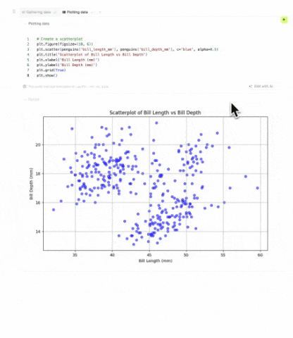
Building on the insights from univariate analysis, the next logical step is bivariate analysis, where you explore the relationship between two variables. This is where you start to uncover the connections and interactions within your data. Using tools like scatter plots to identify correlations between two numerical variables, or box plots to compare the distribution of a numerical variable across different categories, you can begin to form hypotheses about what drives the outcomes you care about. This moves the analysis from simply describing the data to understanding the relationships that will be crucial for any subsequent modeling.
Feature Engineering & Selection
The insights gained from your analysis often lead directly to feature engineering, the process of creating new, more informative variables from the existing data. This is a highly creative step where domain knowledge can have a massive impact. For instance, you might extract the day of the week from a timestamp to see if there are weekly patterns, or you might combine two variables into a ratio that better captures a key business concept. Well-engineered features can dramatically improve the performance of machine learning models by making underlying patterns more explicit.
However, creating new features can also introduce noise and redundancy, which is why feature selection is the other side of the same coin. After generating potentially dozens of new features, it's important to determine which ones have a real impact on your target variable. Using statistical tests or automated methods, you can identify the most predictive features and discard the rest. This ensures that your final dataset is not only rich with information but also efficient and focused, reducing model complexity and improving its generalizability.
Data Visualization for Discovery
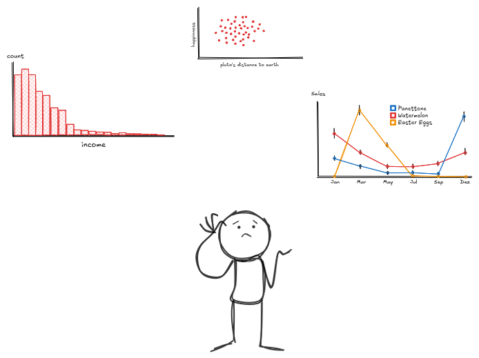
Throughout the entire EDA process, data visualization is not just a means of presentation but a fundamental tool for discovery. The charts created during exploration—histograms, scatter plots, and box plots—are working documents designed to build your intuition about the data. Their primary purpose is to help you see patterns, anomalies, and relationships that are not apparent from summary statistics alone. These visuals are for your benefit, allowing you to have a direct, interactive conversation with the data.
Ultimately, the most powerful insights from your exploration are the ones that can be clearly communicated, and this is where visualization plays its final, critical role. While the initial charts are for discovery, the most effective ones can be refined to tell a compelling story to a broader audience. A single, well-designed visualization can often convey a complex finding more effectively than a dense table of numbers or a sophisticated model. In this way, visualization bridges the gap between your in-depth analysis and the actionable insights that drive business decisions.
Leveraging Your Modern Data Stack for Superior EDA
The modern data stack—comprising cloud data warehouses, transformation tools, and integrated analysis platforms—provides the ideal foundation for high-performance EDA. By centralizing data and streamlining preparation, it allows analysts to move beyond basic data wrangling and focus on the high-impact work of discovery. This shift transforms EDA from a series of disconnected tasks into a cohesive, powerful workflow that is built for speed and depth.
This integrated environment is what makes superior EDA possible. When your data is reliable and accessible, you can iterate on your analysis much more quickly, following your curiosity without being bogged down by technical hurdles. The result is a more dynamic and insightful exploration process, where you can uncover the subtle patterns and relationships that would be missed in a more fragmented and time-consuming workflow. This is where the collaboration between data engineers and data analysts becomes crucial.
The Foundation
Modern cloud data warehouses like Snowflake, BigQuery, and Redshift form the bedrock of this stack, offering a scalable and performant central repository for all your data. These platforms are designed to handle massive datasets with ease, allowing you to query and analyze information at a scale that was previously unimaginable. By consolidating data from various sources into a single source of truth, they eliminate the data silos that have traditionally hindered comprehensive analysis.
Paired with transformation tools like dbt, this foundation becomes even more powerful. dbt allows teams to build clean, well-documented, and reliable data models on top of their warehouse, ensuring that analysts are not starting their exploration from messy, raw data. Instead, they can begin their work with a trusted, high-quality dataset, which dramatically accelerates the initial stages of EDA and builds confidence in the entire analytical process.
Interactive EDA within the Modern Data Stack
While the warehouse and transformation layers provide clean data, an integrated analysis platform serves as a critical part of the modern data stack. It acts as the interactive bridge between the structured, modeled data in the warehouse and the dynamic, ad-hoc analysis required for true exploration. By connecting directly to the data warehouse, these platforms allow analysts to query trusted data models and bring them into an interactive environment designed for rapid iteration and discovery.
This direct integration means you can leverage the full power of your modern data stack without the friction of exporting data or switching tools. It creates a seamless workflow for analytics engineers and data analysts who need to move beyond static dashboards and perform deep, code-first analysis in a way that is both powerful and connected to their data infrastructure. This is where the potential of the modern data stack is fully realized, enabling a fluid and insightful exploration process, even with real-time big data.
Choosing the Best Data Analysis Software for Your EDA Needs
As data teams mature, they inevitably find that their tools shape their thinking. Traditional BI platforms are excellent for monitoring known metrics, but they fall short when the goal is to explore the unknown. This limitation often forces analysts into a fragmented and inefficient workflow, toggling between SQL clients, notebooks, and presentation software, which slows down the pace of discovery.
The conversation around data tooling is shifting because this fragmented process is a major bottleneck. The need is for a more fluid and integrated experience that removes the friction between asking a question and getting an answer. The future of data analysis lies in platforms that are built for curiosity and deep work, not just for reporting. You can see a curated list of the best AI tools for data analysis here.
Beyond Traditional BI: Why Briefer is the Future of EDA
Traditional BI tools are great for showing you what happened, but they hit a wall when you need to understand why. An analyst might see a dip in a sales chart, but to investigate its cause, they have to leave the dashboard behind. This usually means exporting a CSV file or starting from scratch in a separate coding environment, which breaks the flow of analysis and makes it difficult to connect the dots.
This is why the future of EDA lies in Briefer: get the benefits of both without the drawbacks of either. The real problem is the constant context-switching. An integrated workspace eliminates this by combining the power and flexibility of code with the interactivity of a modern UI, all in one place. This is a significant step up from traditional tools like Excel, which can be enhanced with AI but still lack a truly integrated analytical workflow. You can learn more about using AI in Excel here.
Modern Workspaces for Modern Teams
The best data analysis software is designed to collapse this fragmented workflow into a single, cohesive experience. The current rise of AI in data analysis is a key part of this evolution, not as a replacement for analysts, but as a powerful assistant.
An integrated workspace is the embodiment of this modern approach. It connects directly to your data warehouse, allows you to use SQL and Python in the same analysis, and makes your work interactive and reproducible by default. This creates a seamless path from initial query to actionable insight, providing a platform that is purpose-built for the genuine discovery that defines effective EDA.
Real-World Impact: Briefer EDA Use Cases
The true value of a modern EDA platform lies in its ability to uncover actionable insights that drive business decisions. Here are a few examples of how Briefer transforms complex data into clear, impactful results.
Practical Applications of Advanced EDA with Briefer:
Discovering Hidden Relations in Student Performance Data
To understand the factors influencing academic success, an analyst team explored a dataset containing student exam scores, study hours, and demographic information. The goal was to move beyond simple averages and uncover the nuanced relationships between study habits and outcomes across different student groups.
"What is the average exam score based on study hours per day?"
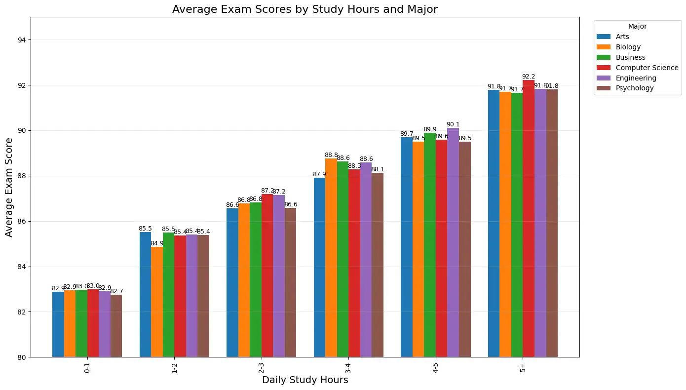
The visualization reveals a consistent positive correlation between study hours and exam performance across all majors. While Engineering students tend to achieve the highest scores in the higher study hour categories, the pattern of improved performance with increased study time is universal. This insight helps validate the importance of study discipline and can inform academic advising strategies.
You can explore more in the generative AI for data visualization blog post.
Uncovering and Optimizing LLM Cost Drivers
A company wanted to control its escalating spend on third-party Large Language Models. The dataset contained API logs with columns for timestamp, user_id, model_name, prompt_tokens, completion_tokens, and cost. The goal was to evaluate current expenses, project future growth, and identify opportunities for optimization.
"How are our LLM costs distributed, what will future costs look like, and how can we optimize our spend?"
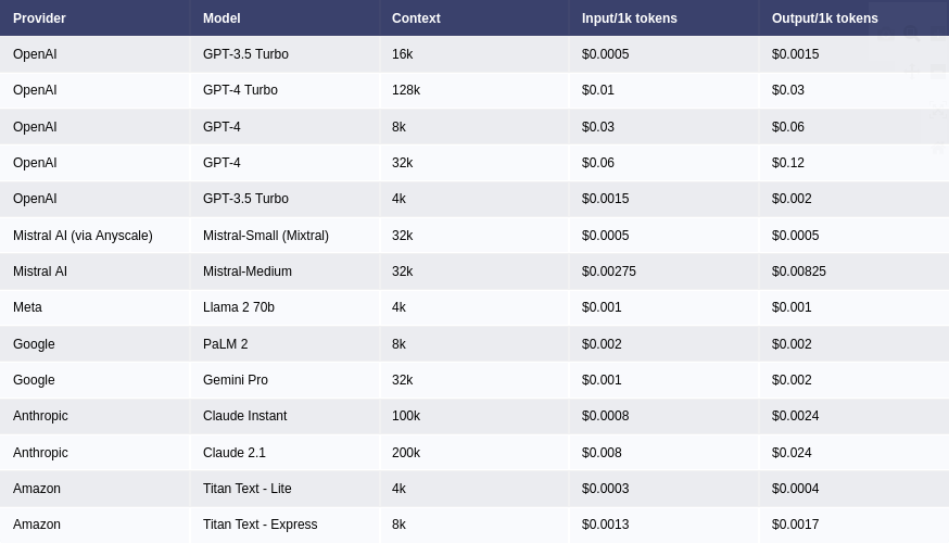
The EDA first evaluated present expenses, revealing that while a low-cost model like GPT-3.5-Turbo accounted for 80% of requests, it was responsible for only 15% of the cost. Conversely, a high-capability model like GPT-4-Turbo drove over 70% of the spend from less than 5% of requests.
Finally, the analysis proposed alternative models to optimize expenditure. It identified that many tasks sent to the expensive GPT-4-Turbo model, such as simple summarization or formatting, could be handled effectively by much cheaper models. This led to clear recommendations: steer users toward specific, cost-effective alternatives for routine tasks, reserving the high-capability models for complex reasoning. This data-driven strategy resulted in a 40% reduction in monthly LLM costs and a more sustainable scaling plan.
FAQs about Exploratory Data Analysis & Briefer
What's the difference between EDA and confirmatory data analysis?
Exploratory Data Analysis (EDA) is an open-ended process for discovering patterns, spotting anomalies, and generating hypotheses from data. It's about understanding the "why" behind the numbers. Confirmatory data analysis, in contrast, is focused on testing pre-defined hypotheses and validating existing assumptions.
Can I perform EDA without coding?
Yes, to an extent. While deep EDA often involves code, modern platforms like Briefer enable non-technical users to explore data interactively. An analyst can set up an analysis, and a business user can then use filters and controls to slice and dice the data without writing any code.
How does Briefer make EDA faster?
Briefer accelerates EDA by collapsing the entire workflow into a single, integrated platform. It eliminates the time wasted switching between SQL clients, notebooks, and visualization tools. Additionally, its integrated AI assistant helps generate code, suggest visualizations, and automate repetitive tasks, moving the process from hours to minutes.
Is Briefer a good alternative to Jupyter Notebooks for EDA?
Yes. Briefer is designed to overcome the limitations of traditional notebooks. Unlike Jupyter, where out-of-order execution can create a "hidden state" and make reproducibility a challenge, Briefer ensures a linear, transparent workflow. The entire analysis is a single, reproducible document, making it a more reliable and collaborative alternative.
How does Briefer fit into my existing modern data stack?
Briefer acts as the interactive analysis layer on top of your modern data stack. It connects directly to your cloud data warehouse (like Snowflake, BigQuery, or Redshift) and allows you to work with the trusted data models you've built with tools like dbt. It bridges the gap between your data infrastructure and the ad-hoc analysis needed for true exploration.
What are the most common EDA techniques?
The most common EDA techniques include:
- Data Profiling: Checking data types, dimensions, and missing values.
- Descriptive Statistics: Calculating mean, median, and standard deviation.
- Univariate Analysis: Analyzing variables individually using histograms and bar charts.
- Bivariate Analysis: Exploring relationships between two variables with scatter plots and box plots.
- Data Visualization: Using charts and graphs to identify patterns and outliers.
How does Briefer ensure reproducibility of my EDA?
Briefer ensures reproducibility by design. The entire analysis—from the initial SQL query to the final visualization—is contained in a single, linear document. There is no hidden state from out-of-order cell execution. When you or a colleague re-runs the notebook, the entire analysis is executed from scratch, guaranteeing that the results are always consistent and trustworthy.
Conclusion
Effective Exploratory Data Analysis is the critical bridge between raw data and actionable insight, yet it has long been hampered by a fragmented and inefficient workflow. By moving beyond the endless cycle of switching between SQL clients, notebooks, and BI tools, modern data teams can finally eliminate the friction that stifles curiosity. Unifying data profiling, cleaning, visualization, and advanced analysis into a single, collaborative environment doesn't just make the process faster; it transforms EDA from a tedious chore into a dynamic and insightful conversation with your data, ensuring that every analysis is both reproducible and trustworthy. This integrated approach, built on the foundation of the modern data stack, empowers teams to move beyond surface-level metrics and uncover the hidden patterns that drive real business value.
This shift from a fragmented to a unified workflow marks a fundamental change in how we approach data exploration, reclaiming the time once lost to tool-juggling for the critical thinking that leads to genuine discovery. By embracing a platform purpose-built for this modern approach, teams unlock their data's full potential and foster a culture of deep, collaborative inquiry. To move from monitoring metrics to making discoveries, learn AI for data analysis and start your analysis with Briefer.