
Learning, to a computer, is just turning bad guesses into better ones. In this post, we’ll see how that starts with a straight line: how linear regression makes the first guess, and gradient descent keeps improving it.
Let's start with something familiar: house prices. Bigger houses tend to cost more; smaller ones, less. It's the kind of pattern you can almost see without thinking: more space, more money.
When we plot it, the shape is clear: a loose upward slope, with some noise but a definite trend.
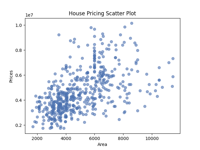
As you can see, price and size move together in a way that feels predictable. Not in fixed steps or categories, but on a sliding scale. A house might go for 305,500, or anything in between.
Now imagine you're selling your own house. It's 1,850 square feet—larger than average, but not a mansion. You've seen what homes go for in your area, but the prices are scattered. What's a fair number to list it at?
One option is to text your real estate friend and get a half-baked guess. A better option is to look at the pattern in past sales and sketch a line that seems to match it. You grab a ruler, hold it up to the scatterplot, and draw something that feels about right. Then you find your square footage on the x-axis, trace upward to your line, and read off the predicted price.
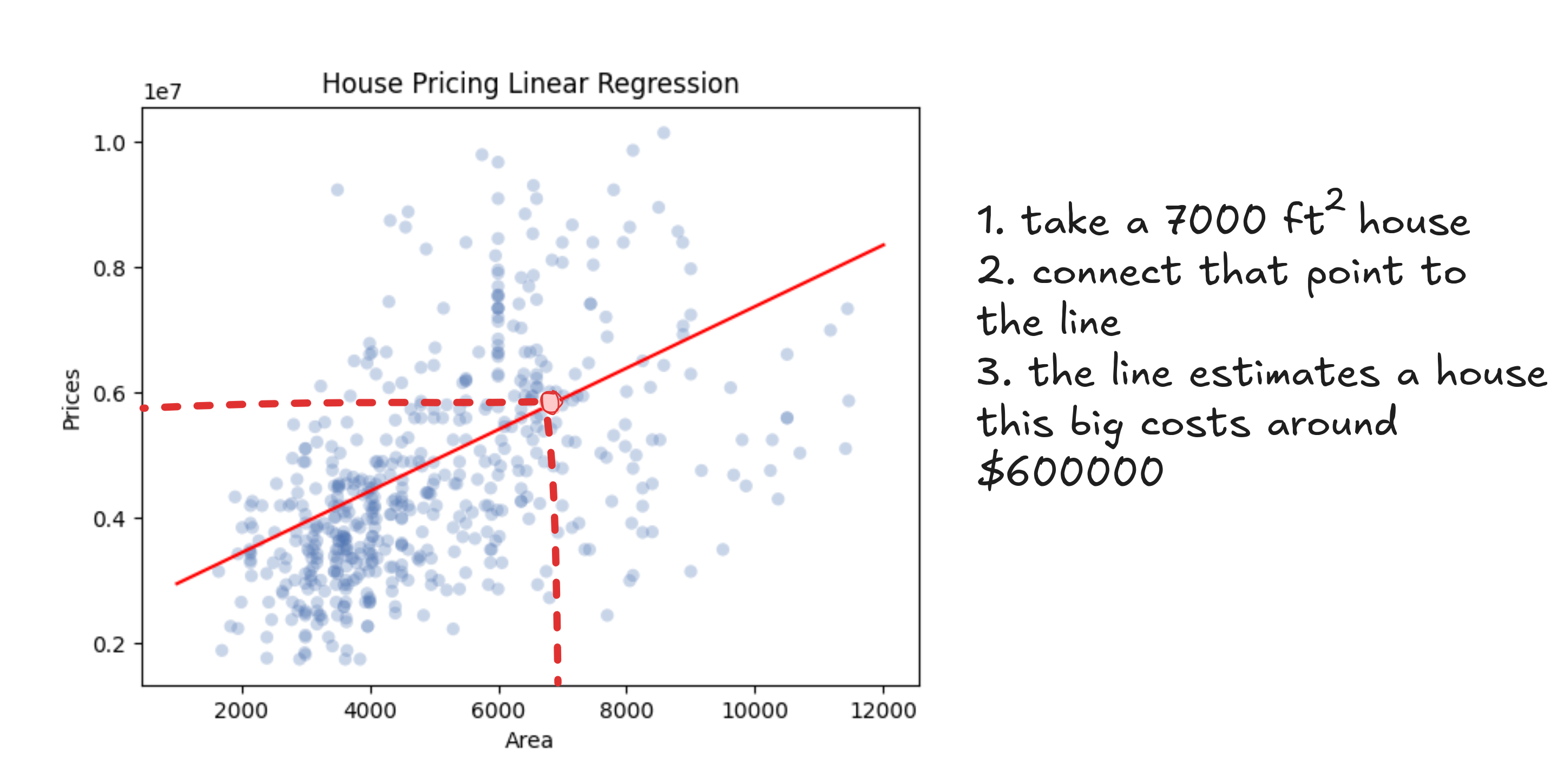
Whatever line you draw, it'll be a steady upward slope. Bigger homes, higher prices. It might not be perfect, but it gives you a way to turn square footage into a price that kind of makes sense.
And while the lines you might draw vary, they all follow the same formula. Each one takes the area of a house (the explanatory variable), multiplies it by a number (the slope), and adds another number (the intercept).

Notice that this isn't just a house-pricing formula. It's how every straight line works. One number sets the tilt (the slope), and the other shifts the line up or down (the intercept). That's all it takes to draw a line: scale, then slide.
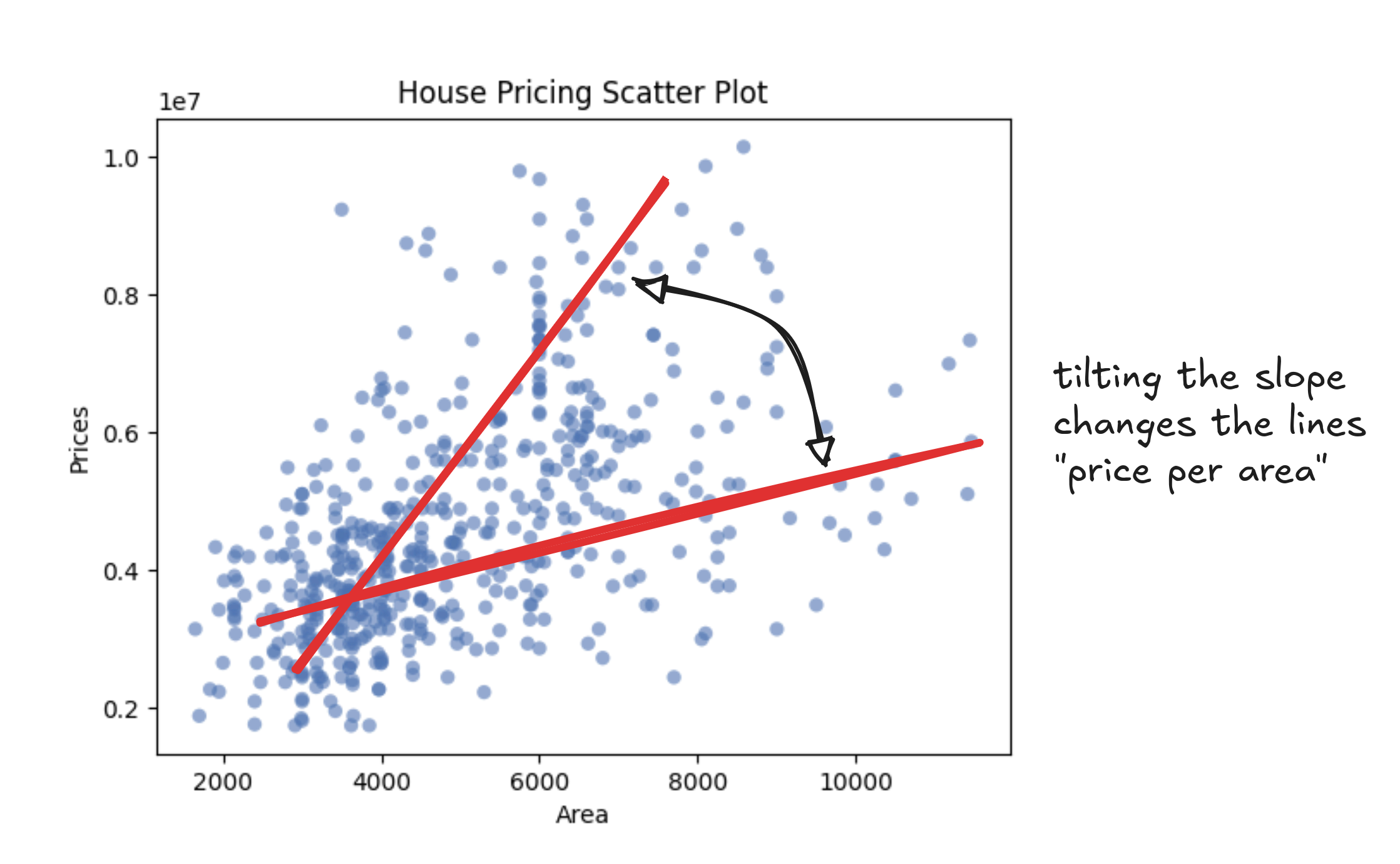
In our case, the slope is the "price-per-square-foot". That's the amount each extra foot adds to the total. If the slope is 150, then a 1,000 square foot home would land at $150,000 just from size alone. A steeper slope means prices rise faster as homes get bigger.
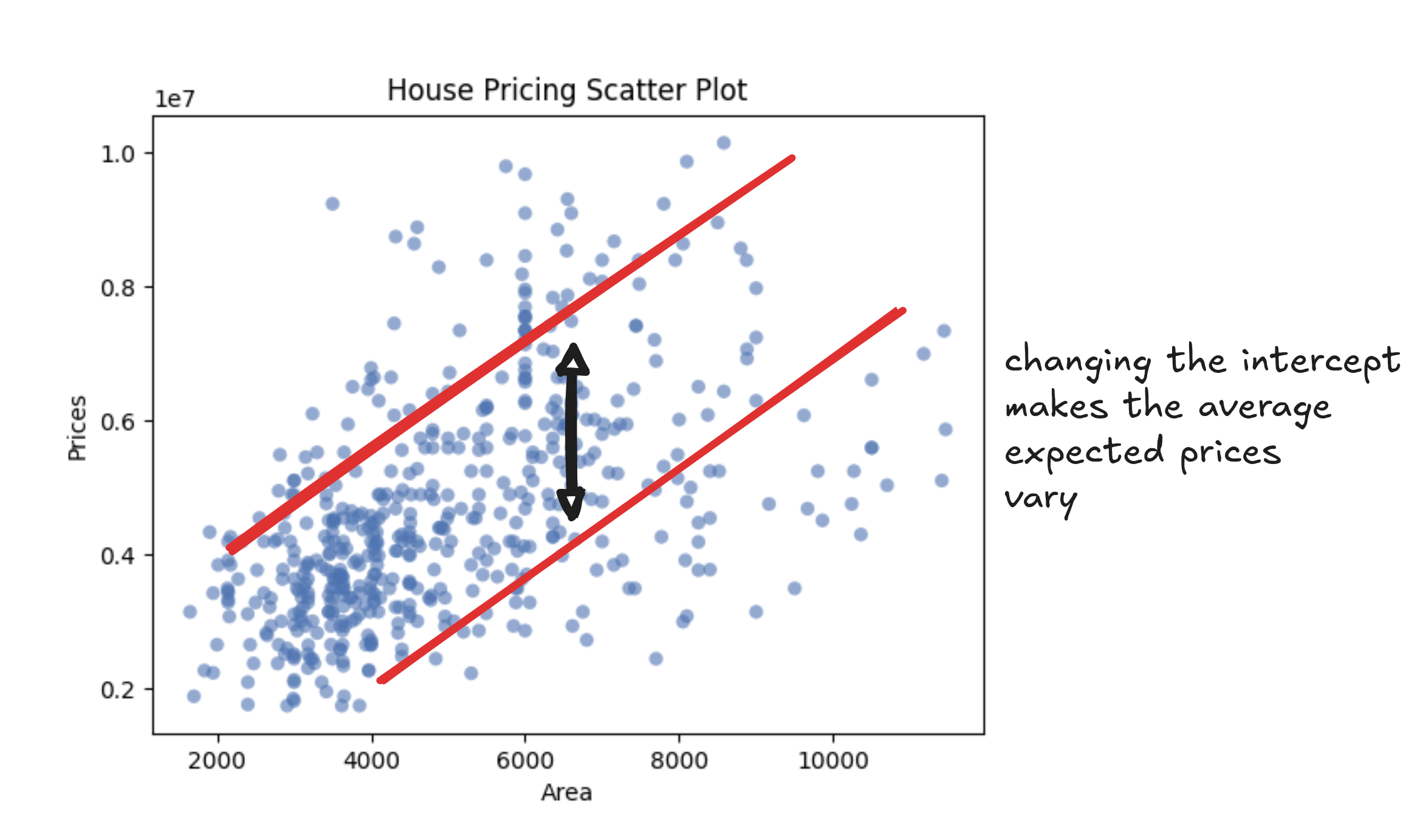
The intercept is where the line starts. It's the predicted price of a home with zero square feet. That doesn't mean much in isolation (nobody's buying a 0-square-foot house), but it sets the baseline, like the minimum price you'd expect even for the tiniest studio. If two neighborhoods increase in price at the same rate per square foot, the one with the higher intercept starts from a pricier floor.
Now that we know each line connects an explanatory variable to a prediction using just a slope and an intercept, the question is: which line should we trust to price our house?
To answer that, we need a way to measure how well a line fits the data we already have.
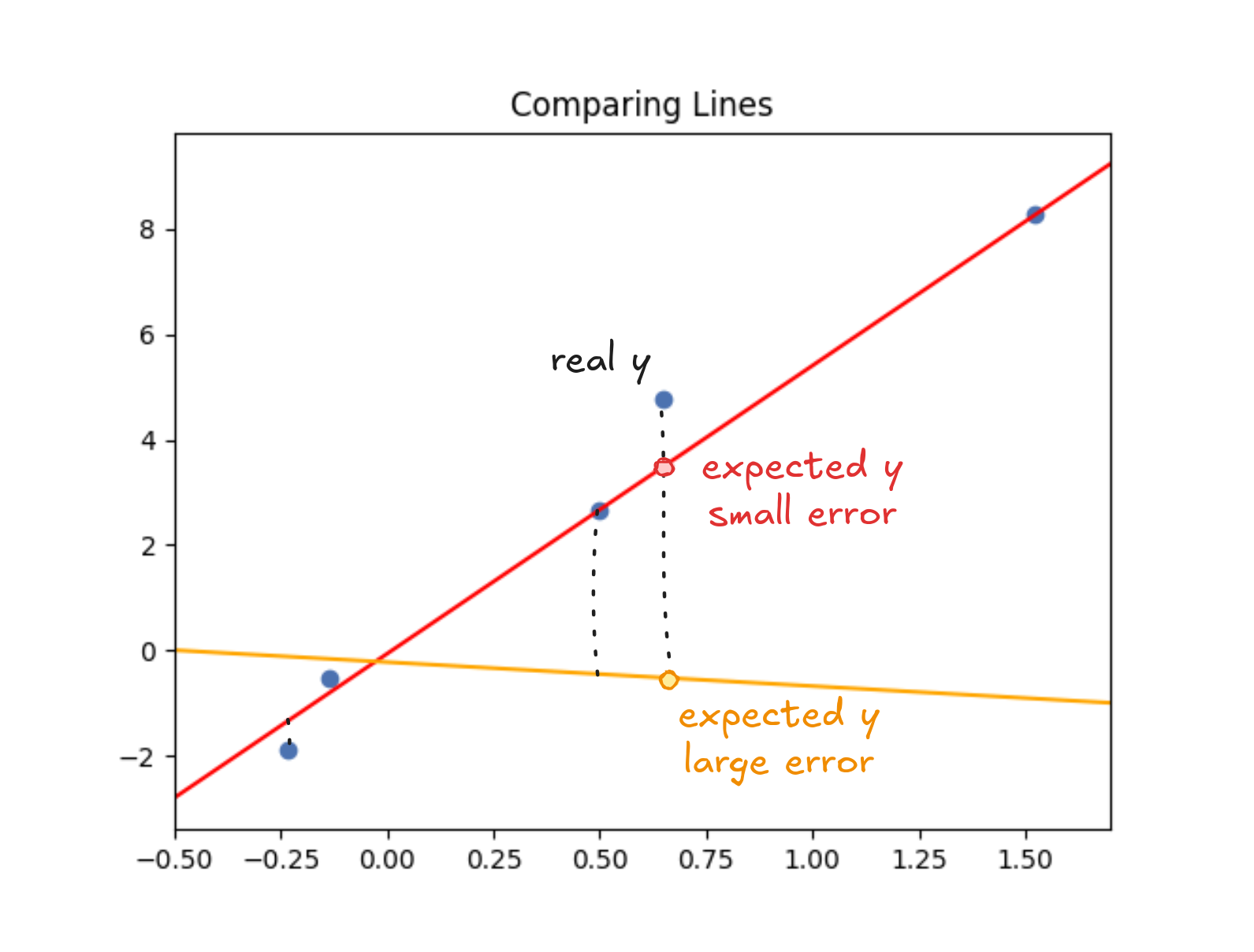
Take one of the houses in our dataset. The line says it should've sold for 375,000. That $25,000 difference is an "error" that measures how far off the line was for that point. Price it too low and you leave money on the table or it too high and the house might not sell.
A good line keeps the gaps between predictions and actual values small. The simplest way to measure how well a line fits is to add up those gaps—the errors.
Of course, there's more than one way to measure error. And how we choose to combine them is what turns guessing into regression.
One simple option is to use absolute error, just like we did in the previous example. You take the difference between the predicted price and the actual price (no matter which one is higher) and treat it as a distance. If the house sold for 350,000, the error is 360,000? That one's off by $15,000. Smaller is better.
To compare lines, you just add up the absolute errors across all the houses. The line with the smallest total error is the winner.
If you're trying to price your own home, this makes intuitive sense: you'd rather be off by 30,000.
But absolute error treats all mistakes the same—two medium errors count the same as one big one. That can hide problems.
If your predictions are always a little off, you're consistently close. But if one estimate nails the price and another misses by $100,000, it's hard to know if the model is solid or just lucky. Consistency matters more than the occasional hit, especially when prices shift over time.
Take home prices, for example. Imagine checking listings in your neighborhood every week. Most of the time, estimates are a little off—maybe 150,000 below market. The next week, another is listed way too high. Suddenly, you're not just surprised—you stop trusting the estimates altogether.
To recover trust in the estimates, we might want big mistakes to count more—not just equally. One way to do that is to make the penalty grow faster as the error increases. In effect, we're plotting the errors on a curve, not a straight line. The further out you go, the steeper the penalty becomes. That's what it means to use a non-linear scale: small misses barely move the needle, but big ones explode.
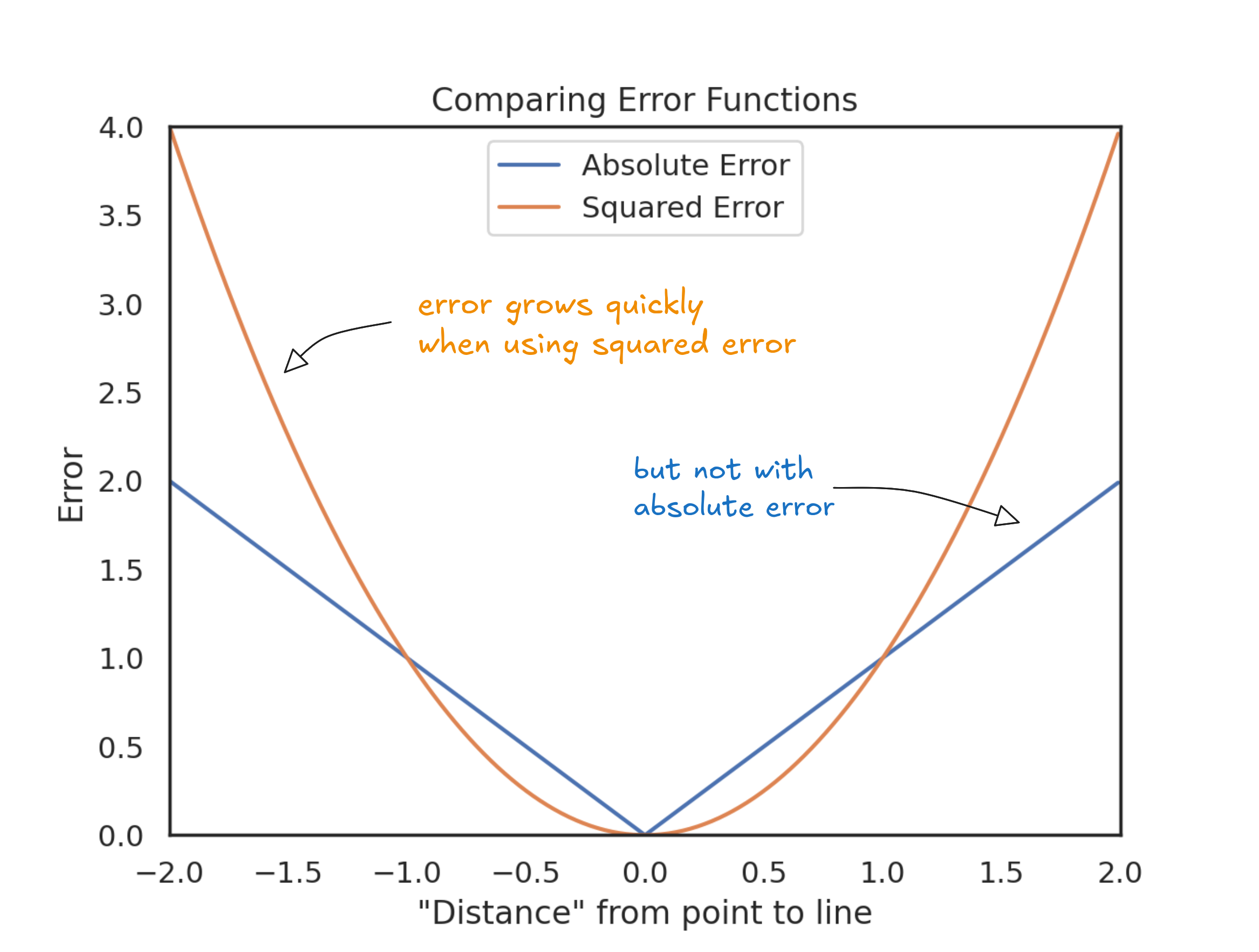
Instead of measuring error directly, we square it. The effect is clear in the plot above: a 10,000—it's four times worse. A $50,000 error? Twenty-five times the cost. Bigger mistakes grow fast. Squaring the errors pushes us toward a line that stays consistently close, not one that swings between lucky guesses and huge misses.
Everything we've done—measuring errors, choosing how to weigh them, and adding them up—comes together into a single idea: the error function. It's just a rule for scoring how well a line fits the data. Squared error is a popular option. Absolute error is another, but they are not the only ones.
Different error functions reflect different priorities. For example, the Deming regression uses a different error function that accounts for errors in both variables—not just the one we're trying to predict. It's useful when both measurements are noisy, like when comparing lab results from two different instruments.
Many lines are close to the data points. We don't want any good line, but the best one (the one with smallest error). No matter which error function you choose, the goal stays the same: find the line that minimizes the error function.
But that raises the next question: where do these lines come from? One option is brute force. Get a set of every possible combination of slope and intercept, one by one. Then, calculate the error and keep the best one.
It works. At least in theory. But there's a problem: there are way too many possibilities. Infinite ones. Testing them all would take forever. We need a more sensible algorithm than computing the error of every possible line.
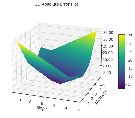
To understand what we're up against, imagine a plot where each point represents a different line: the slope and intercept are the coordinates, and the vertical axis shows how bad the line is—its error. In this landscape of errors, high points mean worse lines; low points mean better ones. Our goal is simple: find the lowest point. We won't actually draw this plot (there are too many possibilities), but picturing it helps make the task clear.
For example, if you look at the absolute error surface, it's a bit of a mess. It's not smooth like a hill or a valley. Instead, it's more like a weird origami sculpture, with sharp edges and folds.
In some cases, like in the example below, every point along the fold gives the same lowest error. If that happens, it means there's not one best line, but many.
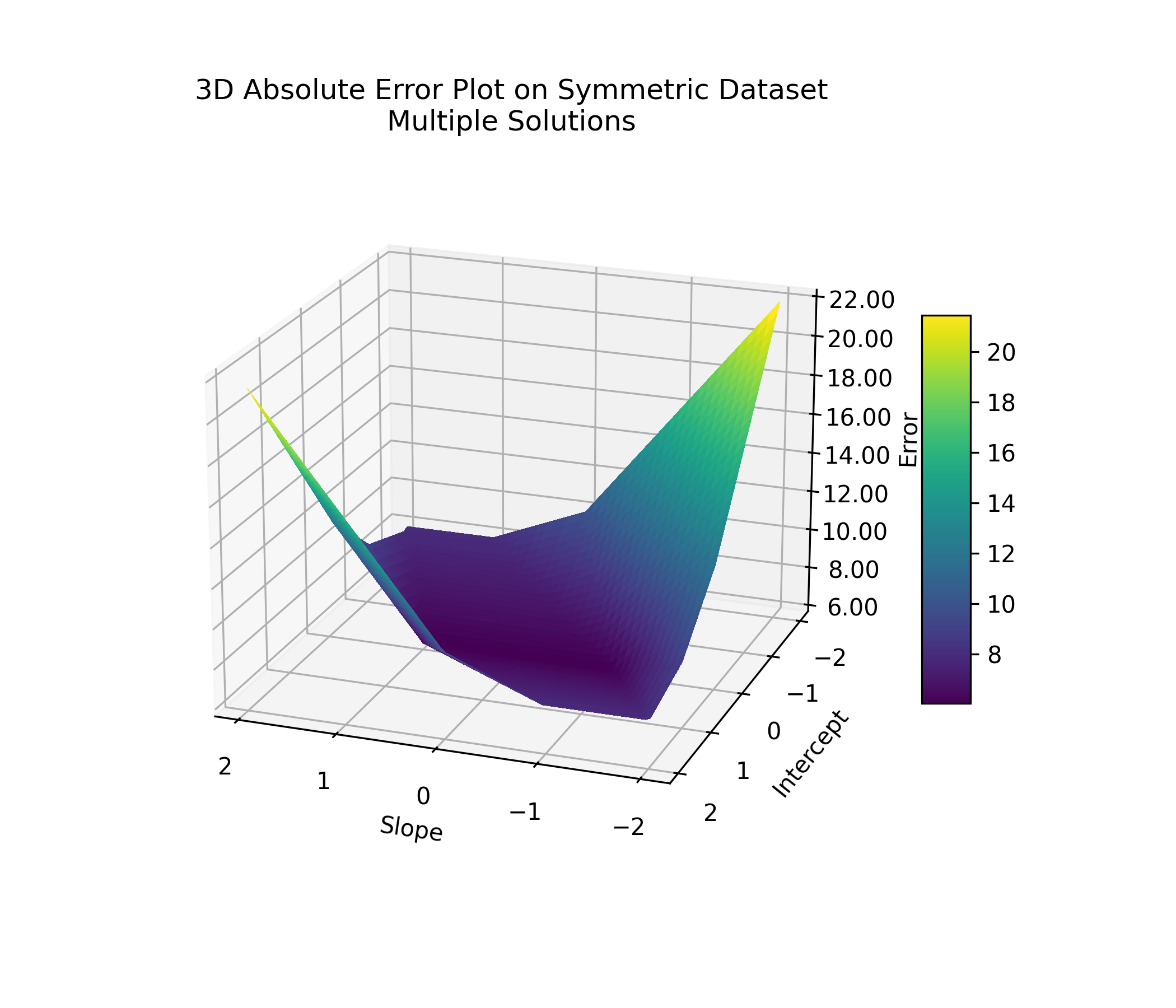
You can see this clearly in a 2D slice: fix the intercept at zero, and a range of slopes yield the same lowest error.
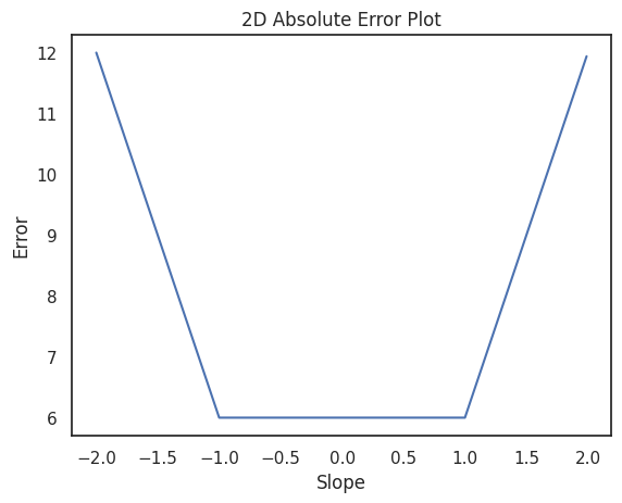
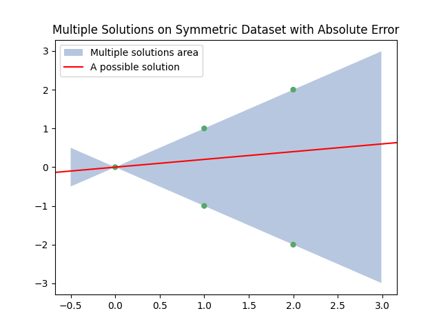
This ambiguity matters because if multiple lines fit the data equally well, then we won't have a single best answer—just a range of equally good ones. Imagine trying to sell a house whose price could reasonably be 500,000, or $1,000,000, depending on which line you pick. Not ideal.
This situation happens when the data points are symmetric: tilting the line slightly brings it closer to some points while moving it away from others, without changing the total error. The plot below shows an example. Any line that passes through the green area (like the red one: is a valid solution.
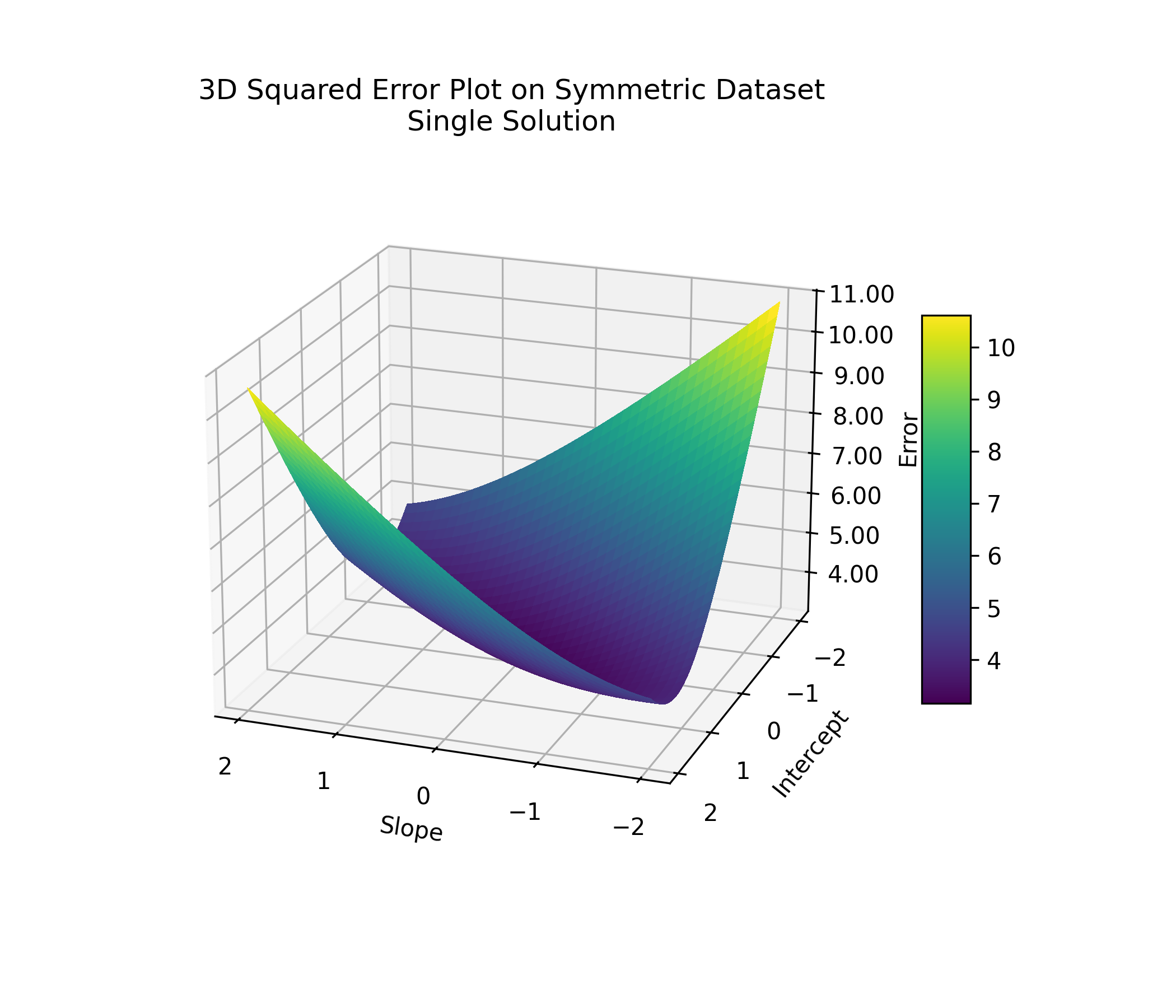
This kind of ambiguity happens to absolute error only. If we were using squared error instead, the plot would look different: smooth and bowl-shaped, with a single lowest point. One best line, stable and predictable.
If you were standing anywhere on that surface, you'd just need to walk downhill to find the best line. Pick the direction where the slope is steepest, take a step, and keep moving downhill. Eventually, you'll reach the bottom.
You don't have to explore in every direction or worry about getting stuck. No matter where you start, as long as you follow the steepest descent, you'll get to the best solution. It might take 100, 1,000, or more steps, but you'll get there.
Of course, we're not actually hiking across hills. In our case, walking downhill means tweaking numbers: the slope and intercept of the line. Each point on the error surface corresponds to a specific line. Nearby points represent lines with similar parameters. By nudging the slope and intercept step by step, we move through this space—chasing lower and lower error until we land on the best fit.
At that point, we can stop and look at the slope and intercept of the line we found. That's our best guess for the price of your house.
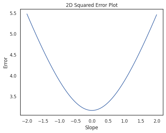
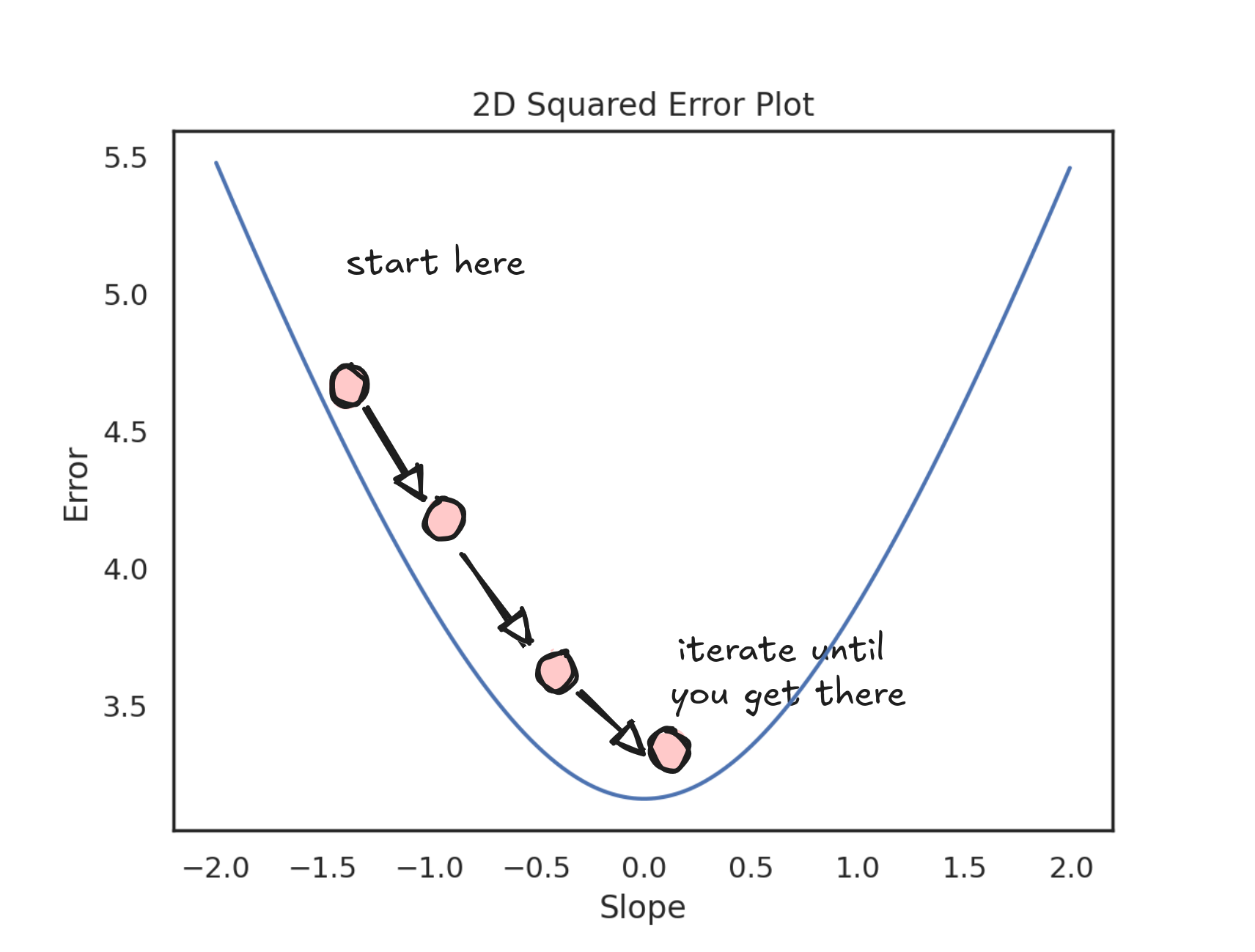
To get a better feel for what's happening as you step down the valley, you can zoom in on just one dimension—the slope. The plot below shows how the error changes as we adjust the slope (while keeping the intercept fixed). Notice how the curve is smooth and bowl-shaped, making it clear how to keep stepping downhill.
At every step, we need to decide which way to move: left or right. To do that, we measure how steep the curve is at our current point. This measurement (the steepness of the curve) is called the derivative.
If the derivative is positive, it means the error increases if we move right, so we should go left. If the derivative is negative, it means the error increases if we move left, so we should go right.
In short: the derivative points uphill. Since we want to go downhill, we move in the opposite direction.
We keep stepping like this—checking the derivative, flipping directions if needed—until we land at a point where the slope is flat. That's when the derivative becomes zero, and we've reached the minimum.
When using least squares, a zero derivative always marks a minimum. But that's not true in general. It could also be a maximum or an inflection point. To tell the difference between a minimum and a maximum, you'd need to look at the second derivative. If the second derivative is positive, it's a minimum. If it's negative, it's a maximum. If it's zero, we're at an inflection point.
This process of iteratively minimizing a function using derivatives is called gradient descent.
The gradient descent is an intuitive and efficient algorithm—and squared error plays especially nice with it.
Squaring the errors keeps everything smooth: no sharp corners, no sudden jumps. That matters because gradient descent needs to measure slopes—and if a function isn't smooth, you can't always define a clear slope to follow.
This wasn't always obvious. In the 1800s, mathematicians like Karl Weierstrass showed that you can have a perfectly continuous curve that's still so jagged that it has no slope at all—not even at a single point. It was a wake-up call: just because something looks smooth from far away doesn't mean it actually is.
Minimizing absolute error runs into a smaller version of this problem. The absolute value function has a sudden bend at zero—right where you most need a clean slope. You can work around it with special tricks, but it's messier and less natural.
Squared error, on the other hand, glides along smoothly. Its derivative is clean, continuous, and geometrically meaningful—it not only points you downhill, but also tells you how big a step to take. No hacks required.
This is pretty much the real reason why everyone squares their errors instead of taking the absolute value, even when it might not be the most appropriate pick. Squared error makes optimization smooth and easy and, as we saw earlier, it also guarantees a single, stable best solution.
As a side note, there are many ways to find a function's minimum, but Gradient Descent rose to fame thanks to its handsome cousin: the stochastic gradient descent, which is the algorithm of choice for training neural networks.
Underneath all the complexity, deep learning still runs on the same basic idea: adjusting parameters to minimize error, step by step, just like we do with Linear Regression and Squared Errors.
It's simple math, sharpened by persistence. The kind of quiet hustle that helps you put a price on a house and actually trust it.