
When I was writing my first book, my publisher taught me that "books with plenty of diagrams sell better". People flip through, see the visuals, and feel like they'll understand it. They don't read a word. They just know, and they buy your book.
Same way you'll scroll through this post and think, "yeah, I'll get this."
That's the trick. Visuals feel easy. Your brain sees shapes and goes "I get this." You don't need to decode a table or read a paragraph. Patterns just pop out.
That's exactly why you should plot your data before doing anything else. Not for decoration. For understanding. You'll spot weird outliers, duplicated trends, clumps of activity, empty gaps—things you'd never notice in raw numbers.
In this post, we'll look at the best plots for getting a feel for your data and what to look for in each one.
Histograms
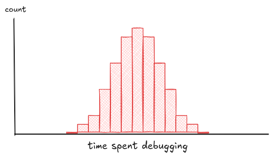
Let's begin with something boring: histograms. They're the fastest way to see the shape of your data—where it piles up, where it thins out, and whether anything looks off. You'll spot skew, gaps, fat tails, or the classic "oh no, this is just one giant spike." It's not fancy, but it tells you what you're dealing with. Before fitting models or running tests, just plot that damn histogram.
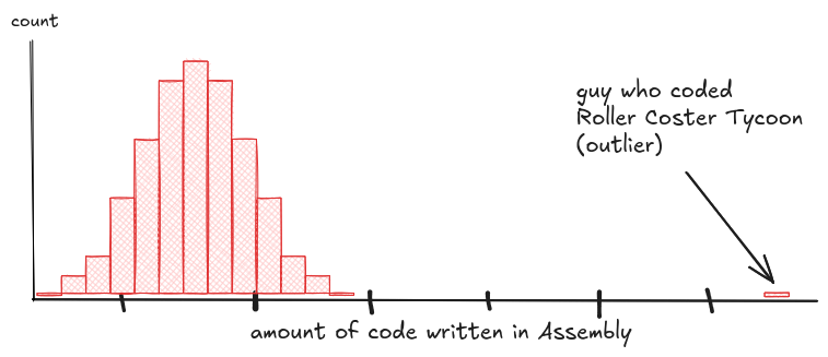
Start with the obvious: outliers.
That one bin way off to the side can stretch your axis, distort your stats, and confuse your model. It might be a bug. Or it might be the most interesting person in the data, like the Rollercoaster Tycoon dev who hand-wrote 50,000 lines of assembly. Either way, it's shaping your results, whether you notice or not.
Then look at the shape of the distribution. Some datasets don't clump around a single peak. Instead, they split.
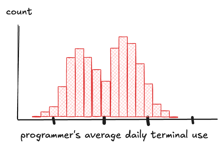
Two humps, maybe three. That's not noise, that's signal. If your histogram has multiple peaks, don't just shrug. Go figure out if you're looking at different groups mixed together.
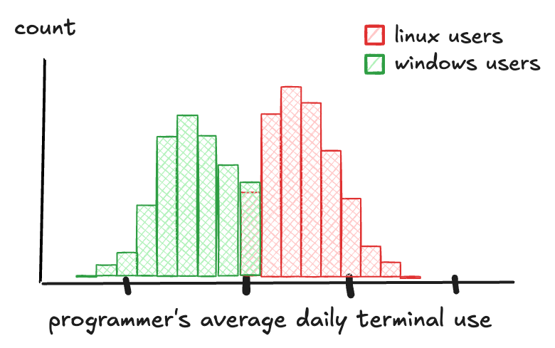
Say you're tracking how often people use the terminal: one peak for folks who barely touch it, another for people who live in it. Dig deeper, and you realize Windows and Linux users were hiding in the same chart.
That kind of split is called a multimodal distribution, and it's a warning: your data isn't telling one story. It's telling several.
Spotting that kind of split matters. It changes how you model, how you segment, how you interpret the results. Otherwise, you're averaging across groups that don't belong together, and whatever you build next will be based on fiction.
Finally, watch out for skew. A distribution is said to be "skewed" if one tail stretches out longer than the other.
A lot of real-world data behaves this way. Take salaries: most people cluster toward the bottom, but a few stretch the scale so far you start questioning the system. That long tail on the right? That's a right-skewed distribution.
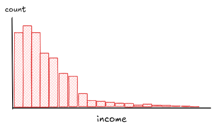
Skew isn't the same as outliers. Outliers are a few rare, isolated points. Skew is structural. It's the shape of the whole distribution. Most users get crammed into one end of the range, while a long tail quietly stretches out and distorts everything else.
Think of a response time metric for an app. Most users get a response in under a second, but a few unlucky ones wait 5, 10, even 20 seconds. That long tail skews the whole distribution.
Now, say you build an alert that fires if response time goes above the 95th percentile. Sounds smart, until you realize that, for most users, that alert never triggers, even when things feel slow. Picking a sensible "default timeout" is just as tricky because the average is skewed by a few extreme cases, so you end up setting a default that's too generous for most users, and too short for the long tail.
Left skew is the opposite: the long tail drags left. Either way, skew can mess with your stats and assumptions. But in many cases, a simple transformation can help straighten things out.
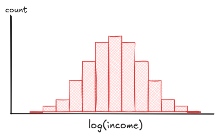
If you see heavy skew, try a simple transformation (like a log scale). It'll compress the extremes, pull the bulk apart, and make patterns easier to see and model.
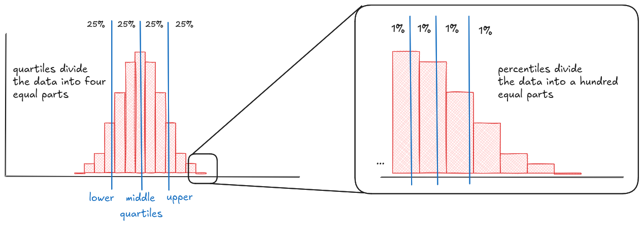
Quantiles
Quantiles slice your data into equal-sized chunks. They give you a structured way to understand the spread without getting bogged down in raw numbers. Instead of eyeballing two histograms and guessing which one's "more spread out," you can just compare their quantiles. Are the medians far apart? Is one dataset more compressed in the middle but stretched at the edges? Quantiles help you spot those patterns. Therefore, plotting quantiles right on the histogram makes those patterns easier to see and easier to explain.
Some of the most familiar quantiles are percentiles and quartiles. Percentiles slice your data into 100 pieces, quartiles into 4. They show up everywhere, from test scores ("you're in the 90th percentile") to dashboards ("p95 latency"). The middle quartile (the 50th percentile) is your median, and it's often a better summary than the average, especially when your data's skewed or full of outliers.
Let's say you're tracking API response times. You plot the histogram and it's a mess: most requests are fast, but a few are way out to the right. Now add vertical lines for the median, 95th, and 99th percentiles. Suddenly, the picture sharpens. The median says "half our users get a response in under 200ms". Great. But the 95th percentile shows some are waiting 2 seconds, and the 99th is worse. Those tails matter. They're the users calling support, churning, or tweeting screenshots. Plotting quantiles doesn't just show spread. It tells you who's going mad.
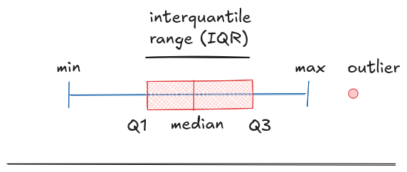
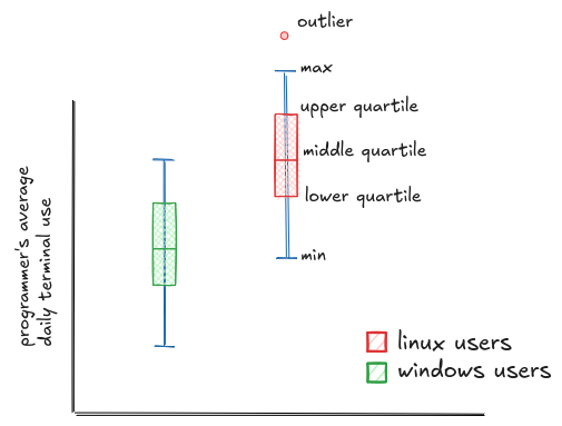
Box-and-whiskers
Quantiles are great for understanding spread but they're still just lines on a histogram. What if you want to compare distributions side by side, across groups or categories? That's where box-and-whisker plots come in. They take those same quantiles and turn them into a compact, visual summary.
The box shows the middle 50% of your data, from the 25th to the 75th percentile. The lines, called whiskers, usually extend to the smallest and largest values that fall within 1.5 times the height of the box. Anything beyond that is flagged as a potential outlier and plotted separately. That's the standard in most tools like Python's matplotlib and seaborn, or R's ggplot2, and it gives you a quick way to see both the bulk of your data and what's unusually far from it.
For example, let's go back to our terminal usage data. This time, we plot a box-and-whiskers chart comparing Linux and Windows users. Now the difference jumps out: the least active Linux user still uses the terminal as much as the median Windows user. The entire Linux distribution is shifted higher. You could see the peaks in the histogram, but now the comparison is concrete. You can point to the medians, the spread, the outliers. It's no longer just a feeling. It's a fact.
Violin plots
Box plots are great for comparing groups, but they hide one important detail: the actual shape of the distribution. You get the quartiles, the median, and some outliers, but not whether the data is clumped, stretched, or split into separate groups. It can make everything look smooth and simple, even when the reality is a lot messier.
Violin plots fix that. They keep the summary from the box plot, but overlay it with a smoothed curve that shows the full distribution (essentially, a rotated and mirrored histogram). That way, you get the best of both worlds: clean comparison and full context.
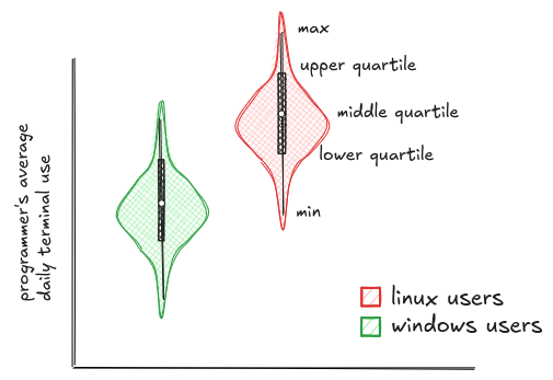
But violin plots only work when you're comparing distributions, not when you're tracking values over time or looking at raw counts. And visually, they can get messy and overcomplicate simple data. So use them when you need to compare distributions - but for other types of comparisons, you'll want different tools.
Bar plots
If you're comparing a lot of groups, violin and box plots also start to fall apart. Too many shapes, too little clarity. In those cases, it's better to aggregate the data (using the mean, median, max, etc.) and switch to a bar plot. Bar plots make it easy to scan and compare lots of categories side by side.
And just a quick reminder: avoid pie charts. They make it almost impossible to compare values accurately, especially when the slices are close in size. Your brain isn't wired to judge angles or arc lengths, but it's great at comparing bar heights. Pie charts look friendly, but they hide the data.
To bring it home, here's a simple example. I pulled some of the most popular programming languages from the Stack Overflow 2024 survey. The bigger the bar, the more people use it. No smoothing, no quartiles. Just raw counts, stacked side by side.
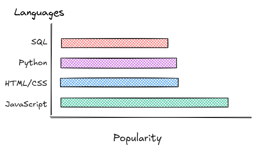
And yes, unfortunately, JavaScript is still there. Some truths you just have to accept.
Scatter plots
Bar plots are great for comparing quantities across several categories-one variable, maybe broken down by groups or periods. But they can't show how two things change together, like whether developers who sleep more write fewer bugs. That's where scatter plots come in.
Scatter plots let you see relationships between two continuous variables. Want to know if more debugging leads to less happiness? Or if people who drink more coffee ship more features? Plot the points. Each one is a pair (X and Y) and the shape they form tells the story.
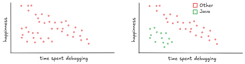
Here's a classic example: happiness vs. time spent debugging. Each red dot is a programmer. The trend is clear: the more time you spend debugging, the less happy you are.
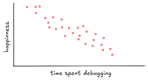
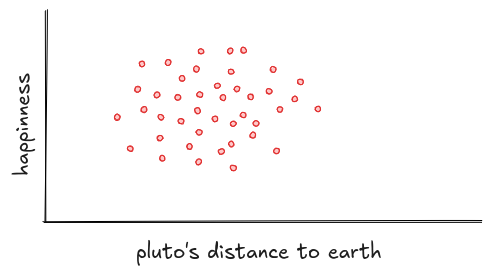
So what should you look for in a scatter plot? Start with the shape. If the points stretch into a line or an ellipse, there's probably a real relationship. If they form a vague cloud or a neat circle, the variables likely aren't connected, like happiness and Pluto's position. Unless, of course, you believe mood swings are caused by retrograde motion.
You might also spot clusters: groups of points that behave differently from the rest. Maybe there's a bunch of users who are never happy, no matter how little they debug. Plotting them separately can reveal what's hiding underneath. Turns out, they're all Java developers still stuck writing getters and setters.
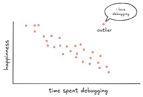
And don't forget about outliers. Scatter plots are great at making them stand out. Like Jonathan, the programmer who loves debugging. While everyone else sinks, he soars. Maybe he's an error. Maybe he's a genius. Either way, he breaks the pattern.
Sometimes that's all you need: a clear line, a weird outlier, a tight little cluster. But other times, the pattern hides in the shape. Not every relationship forms a neat straight line. A lot of traditional stats assume it does, but real data often bends, flattens, or takes strange turns. That's exactly where plotting helps. It shows you when things are drifting from expectations before you build the wrong mental model.
Say you're looking at how coffee affects programmer productivity. Plot the data, and you might notice something interesting: productivity rises at first, but then levels off. That kind of pattern is nonlinear: it curves instead of forming a straight line.
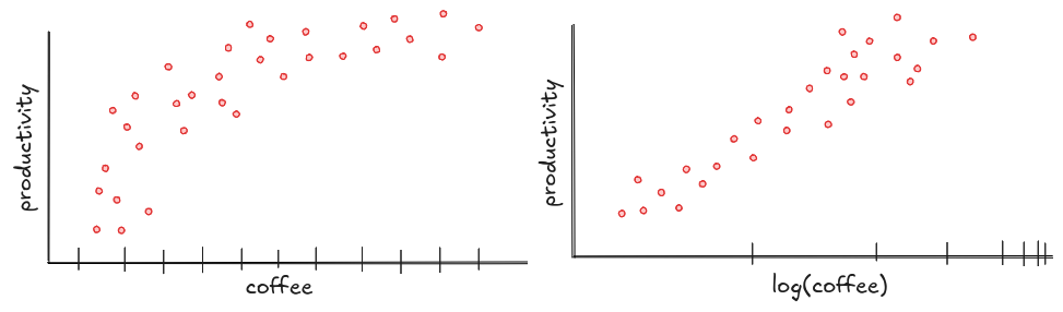
Why does that matter? Because if you assume a straight line when the relationship curves, your predictions will be way off, especially at the edges. You'll think the tenth cup of coffee makes you twice as productive, when in reality it just gives you a minor panic attack.
Sometimes, a simple fix, like applying a log scale to the axis, can help straighten things out. Plots like this don't just show you what's happening; they show you when simple assumptions break down, and when you might need to look at the data a little differently.
Heatmaps
Scatter plots are great for seeing how two variables relate. But what if you need to add a third variable? That's when you turn to heatmaps.
Instead of points scattered on a plane, a heatmap uses color to represent that extra dimension, making complex patterns easy to spot.
A classic example is GitHub's contribution heatmap. The two axes show months and weekdays, while the color shows how many commits someone made each day. Take a look at the one below. That's Linus Torvalds' contribution history. At a glance, you can see when he's most active, and when things cool down.
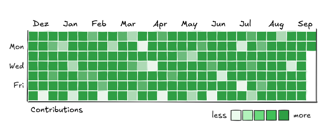
Choosing the right color palette matters because it shapes how people interpret your data. Usually, darker colors feel like "more" and lighter colors like "less," but that's not a fixed rule, it depends on context.
Imagine flipping GitHub's heatmap colors: intense, dark squares for zero activity would feel weird, right? When your data has a meaningful midpoint, like temperatures centered around zero, it's best to use a diverging color palette, where two colors meet in the middle. Cold goes one way, hot the other, and zero stays neutral.

So what should you look for in a heatmap? Patterns and contrasts.
Look for clusters, where values pile up in one area, and gaps, places where things consistently go quiet. Pay attention to streaks-rows or columns that stand out-and sudden color shifts that might point to meaningful events or changes. Heatmaps are all about spotting these trends at a glance, so trust your eyes first, then dig deeper.
Line plots
Bar charts shout. Pie charts charm. Line Plots reveal motion. They show how things change across time, categories and variables. The points represents average over time and the lines are maximum and minimum measurements.
Take Brazilian product sales over time. Here, the y-axis is units sold over years. Each line is a product: Watermelons, Easter eggs, and Panetone, an Italian Christmas cake that's actually more popular in Brazil than in Italy. In a way, it's the Brazilian version of British mince pies.
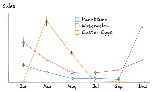
Here you can see that Panetone flatlines for most of the year and then skyrockets in December. Watermelon peaks in the hottest months, January and February, then cools off as summer fades. Chocolate eggs show a clear spike around Easter, then, they're gone like they never existed.
That's the magic of line plots: they don't just track numbers. They reveal timing, behavior, and opportunity, all in one continuous story.
Putting it all together
We've seen a lot of plots-each with their own strengths. But across all of them, the questions you're asking are very similar.
Whether it's a histogram, a scatter plot, or a heatmap, the goal is to get a feel for the data. To see what stands out, what's typical, and where things behave differently than expected.
Here's what to look for-no matter what plot you're using:
- What's typical? What values are common, where does the data cluster, and where does it thin out?
- What's unusual? Are there outliers-points that stand far from the rest? Are they errors, or something worth investigating?
- Is the data shaped how I expect? Look for skew, gaps, and multiple peaks. Real-world data is rarely smooth.
- Are there clear groups? Do values naturally split into clusters? Can you tell them apart, or are they overlapping?
- How do variables move together? Does one go up as the other goes down? Is it linear, curved, or noisy?
- What's missing? Are there empty spots where data should be? Do any categories or ranges look oddly quiet?
The more you practice spotting these, the faster they jump out-long before you run any numbers. That's the real power of plotting: it gives your brain something to lock onto before your tools even get involved.
By the way, remember how I said visuals feel easy? How your brain skips the words and just says, "yeah, I get this"?
You just did.