
Recommendation systems don’t understand preferences, they just measure behavior.
Every click, scroll, and rating becomes a vector. Then it’s all math: compare those vectors, spot patterns, and guess what comes next.
What feels like intuition is really correlation. Strip away the complexity, and it’s just the machinery of judgment: quantifying behavior, comparing signals, and betting on what comes next.
This post is about those measurements: how we encode behavior into numbers, and the different ways we can decide when two things are "similar enough" to drive a recommendation.
Finding Simularities in Data Through Distances
To see how this works in practice, let’s look at something familiar: restaurant ratings.
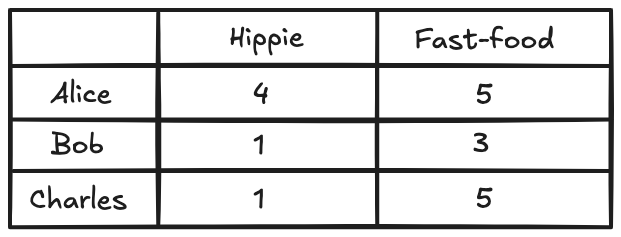
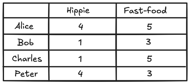
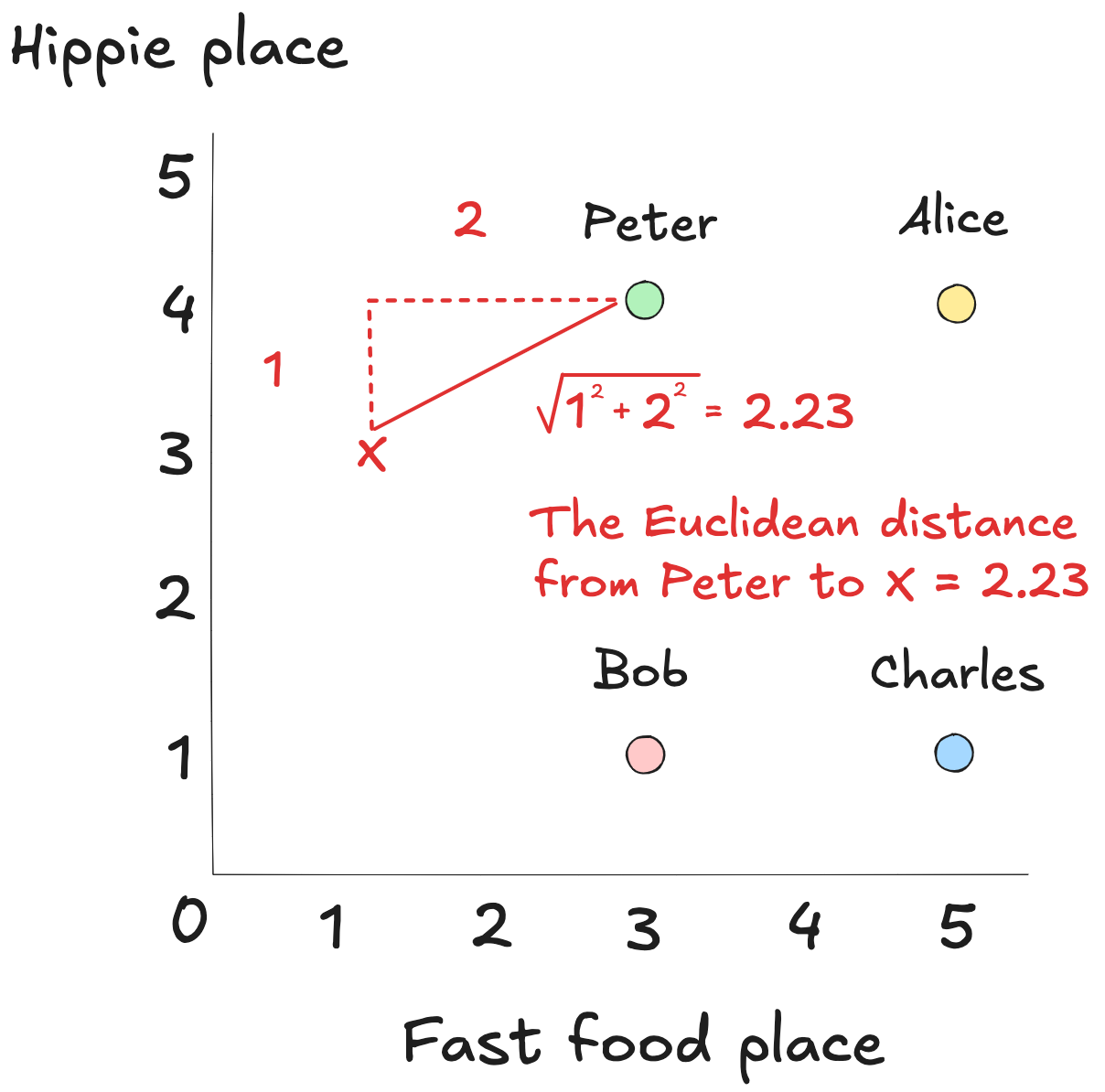
Imagine we’ve recorded how three different people scored a hippie café and the fast-food place next door. The ratings go from zero to five. Zero means they hated it, and five means they thought it was excellent.
Now, let’s say Peter enters the picture. We’ve got his ratings for the same two restaurants, and we’d like to use that to suggest one he hasn’t visited yet.
We can approach this by visualizing everyone's restaurant preferences, including Peter's, on a graph, where each person is represented by a point based on their ratings.
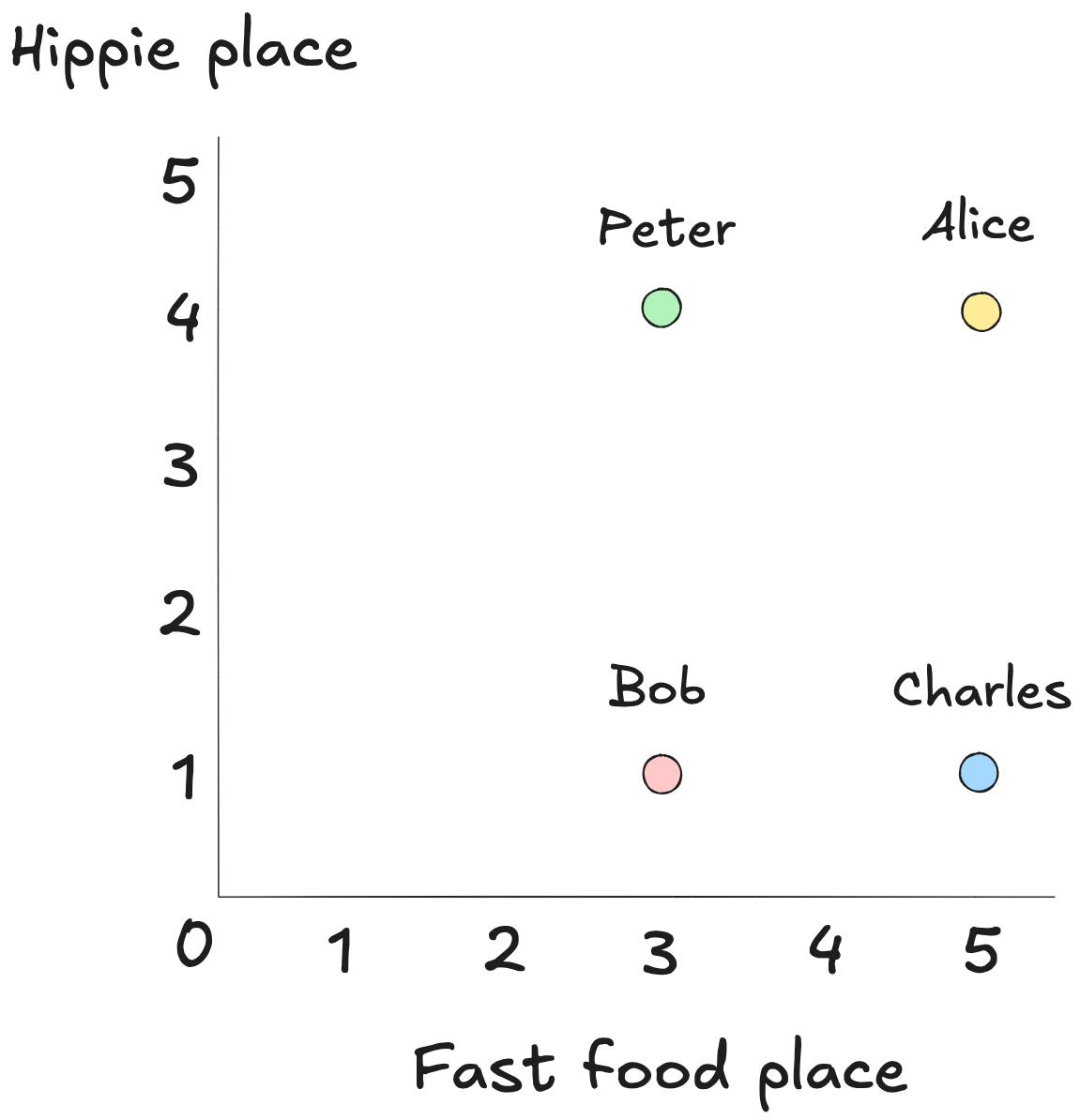
The key is to find people whose tastes are similar to Peter’s. On the graph, that means looking for points near his. The closer two points are, the more alike their ratings.
One way to do this is by summing the vertical and horizontal steps it would take to get from one point to the other, as if we could only travel in straight lines, up or across.
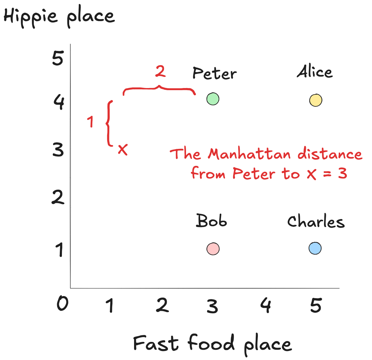
This method is called Manhattan distance (or cityblock() in SciPy`).
It is fast, which comes in handy when theres a lot of data to process. Sometimes fast is good enough.
Another option is to draw a straight line between the points. That’s Euclidean distance (SciPy’s euclidean()).
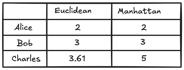
By identifying Alice as Peter's nearest neighbor, we've narrowed our search. Her high ratings now serve as the most relevant data for predicting what Peter might enjoy next.
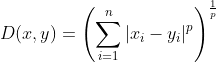
Both Euclidean and Manhattan distances are, in fact, variations of a broader mathematical idea known as the Minkowski distance.
Rather than being a single formula, Minkowski distance is a family of distance metrics that flexes based on a parameter,_ p_. This parameter determines how we combine the differences across each dimension to calculate the total distance.
Mathematically, it looks like this:
At p = 1 (Manhattan distance), the metric treats all differences equally. Each coordinate's difference counts linearly, like walking city blocks: a few small steps in many directions matter as much as one big leap in one.
At p = 2 (Euclidean distance), the metric begins to emphasize larger differences more. This is the familiar "straight-line" distance, where bigger gaps have an outsized influence.
As p increases beyond 2 the metric becomes even more sensitive to the largest differences in any coordinate. In the limit, as p → ∞, only the single largest difference matters. This is known as Chebyshev distance, where the metric effectively says, "I only care about the worst-case deviation."
By tuning p, we can tailor how sensitive our similarity measure is to outliers, clusters, or particular behaviors.
These algorithms deliver speed, certainly. But before trusting the output, we might ask whether everyone’s measuring with the same ruler or if some are holding theirs at a slant.
The Pearsons Correlation Coefficient
Up to this point, we’ve treated ratings as if they’re uniform: a 4 from one person means the same as a 4 from another.
But one may only rate 4s and 5s. Another stays below 3. A third switches between 2 and 5, with no middle ground.
How do we compare ratings when the same number reflects different standards?
The Pearson correlation coefficient helps us cut through that subjectivity by comparing patterns, not scores. Consider the table of ratings below:
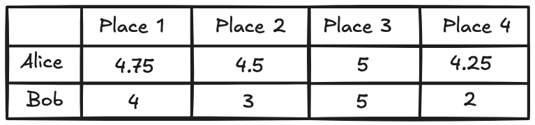
Alice and Bob both rated four restaurants. They agreed that Restaurant C was the best, followed by A, then B, and finally D.
The numbers they assigned differ. Alice sticks to the 4–5 range, Bob is more liberal with the lows, but their ranking is identical.
Plot Alice's ratings on one axis, Bob's on the other, and the points align neatly along an upward-sloping line. This is what perfect agreement looks like—not in absolute values, but in pattern.
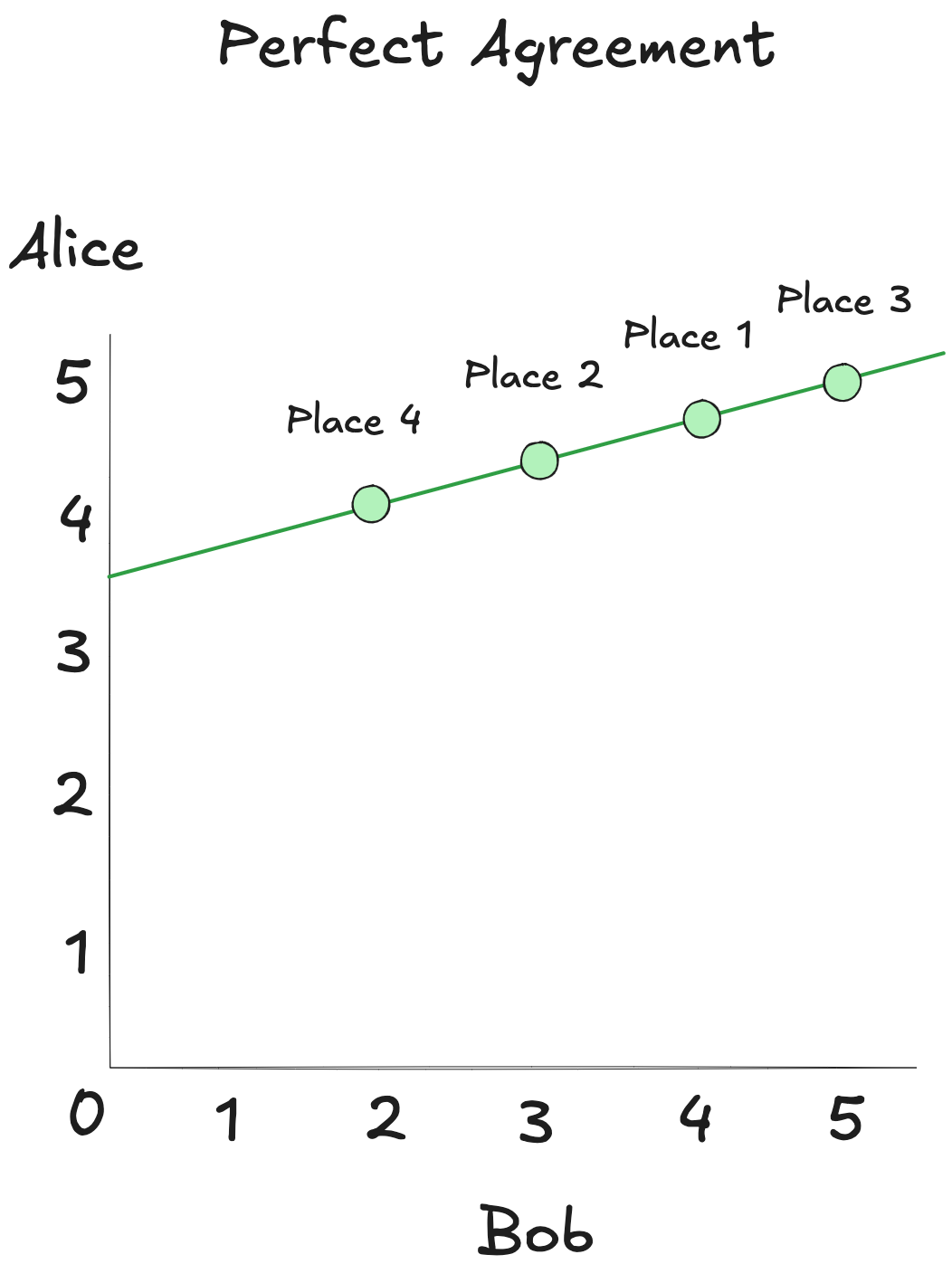
If Alice gave high marks to a place Bob hasn't visited, it's likely he'd feel the same.
Pearson correlation turns less obvious patterns into useful insights. It doesn't matter whether someone is generous or stingy with their scores.
It measures is how tightly two sets of numbers track each other's ups and downs: are they moving together linearly, even if not in the same register?
In this case, even though Bob’s scores dip lower than Alice's do, their preferences move in sync. High for Alice means high for Bob. Low means low. The Pearson coefficient for their ratings is near +1. That's a strong positive correlation (SciPy's pearsonr() lets us compute it directly).
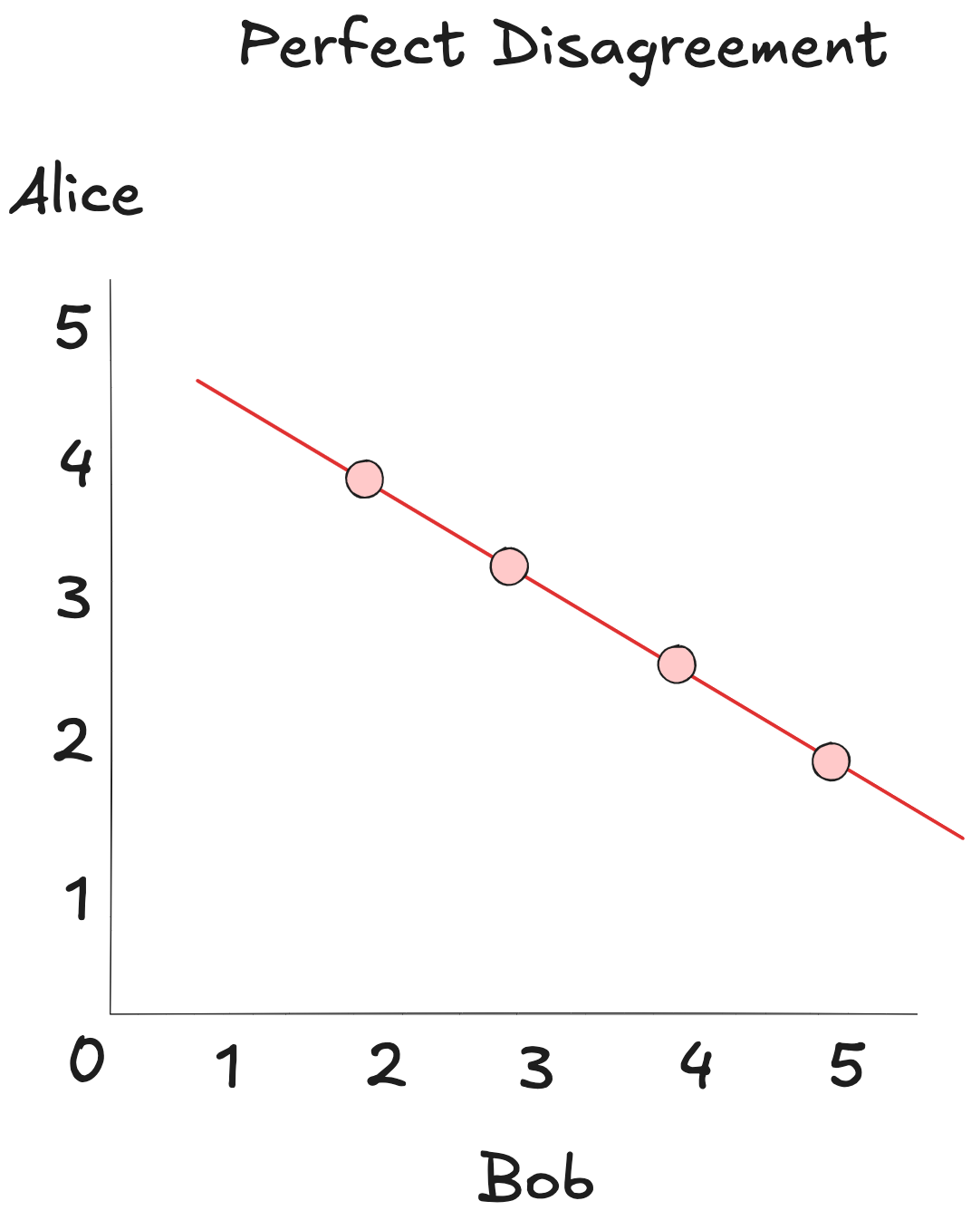
Now reverse Bob's ratings: what Alice loves, Bob hates, and vice versa. The plot now tilts downward, forming a straight line in the opposite direction. That's a Pearson coefficient of -1. That's perfect disagreement.
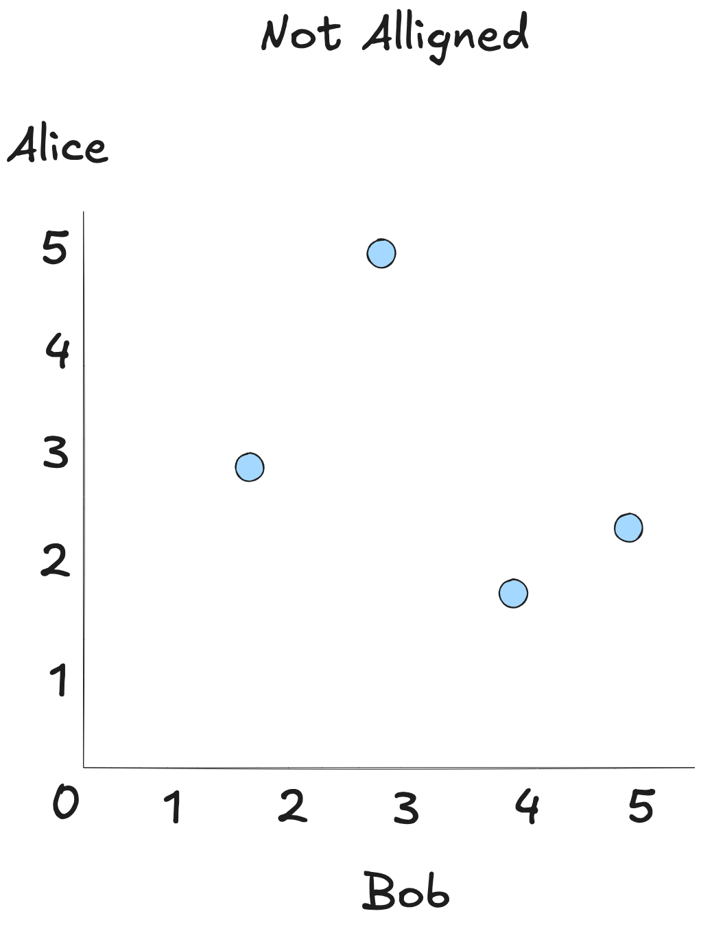
Finally, imagine a scatterplot of ratings with no pattern at all. Alice's highs are Bob's lows, mids, or anything in between. There’s no consistent relationship. The Pearson correlation here hovers around 0, signaling no meaningful alignment.
Pearson captures the strength of a single relationship. But good recommendations usually come from patterns across a crowd, not just one person.
That’s where k-nearest neighbors steps in.
K-nearest neighbor
Consider two users that might look identical on paper: both rate horror films highly and avoid animation and binge thrillers. Pearson and the distance metrics treat them as the same profile, so recommending one user’s favorite to the other seems reasonable.
But then one gives five stars to a romcom buried in the catalog and we recommend Notting Hill to the other. It doesn’t go well.
Anomalies like this are inevitable at the individual level. The group, however, tends to converge on something stable.
We can harness that stability by leaning on what we already know: use Euclidean or Manhattan distance to identify a group of K users who rate content in roughly similar ways. That gives us proximity, which is a behavioral neighborhood.
Next, we bring in Pearson correlation to evaluate how closely each user’s taste aligns with the target’s preferences.
Now we have both pieces: who’s nearby, and how much their opinion should count.
That's the core idea behind k-nearest neighbors.
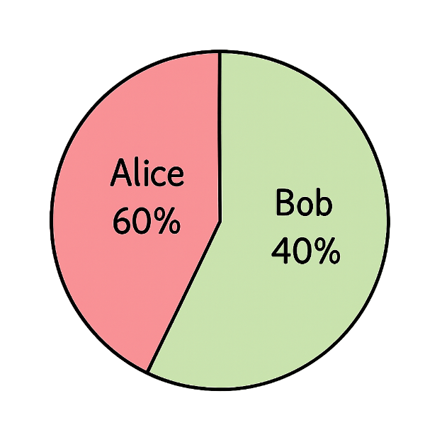
Assume Alice and Bob are the two users most similar to our target Peter, to whom we're trying to recommend a new restaurant. Their Pearson correlations with Peter’s ratings for the hippie restaurant are:
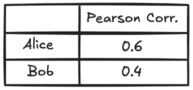
Their inputs aren't equal. Alice's correlation with Peter is stronger, so her opinion is weighted at 60%, while Bob's accounts for 40%. This weighting reflects the degree of alignment.
We compute the recommendation by aggregating these two inputs proportionally.
It’s a clever balance: multiple perspectives, weighted by similarity.
But there's no such thing as a free lunch: the more neighbors we include, the more time we spend calculating correlations. And the more neighbors we include, the more likely we are to include outliers or dilute the signal, which can lead to more generic recommendations.
Knowing Your Data Matters
How you measure similarity shapes what you recommend. The better the fit to your data, the better the recommendations that follow.
Collaborative filtering is a solid foundation. Real-world systems often go further, blending these tools with deeper models of behavior and context.
When most values are present and their magnitude is meaningful, distance metrics like Euclidean or Manhattan can capture genuine gaps in behavior.
But when users apply the same scale differently—some rate high by default, others hold back—Pearson correlation is better. It ignores magnitude and focuses on whether preferences move in the same direction.
In a k-nearest neighbors setup, your choice of metric defines who qualifies as "nearest." Distance gives you behavioral closeness. Pearson gives you preference alignment. Combine both, and you get not just who’s similar—but how much their opinion should count.
No single metric fits every case. What matters is understanding your data and what similarity should actually mean.